

PM Biomedical
Re-design of main user flows for a B2B biomedical equipment + repair company, to provide user with a more intuitive experience
high level design goals:
Improve user experience of a medical equipment website’s price request user flow, by refining certain functions and interactions that cause friction for users.
Decrease drop-off and bounce rate, and increase retention rate.
Increase overall sense of trust in website services.
company overview
PM Biomedical offers a range of services for Patient Monitoring Equipment:
Purchase
Repairs
Rentals
Cables + accessories
Tools:
Adobe XD
Figma
Miro
Illustrator
Photoshop
Google Workspace
Zoom
Duration:
4 months
Role:
UX/UI Designer
problem
Based on the client’s analytics, there are friction points that lead to an increase in drop-off and bounce rate, and a decrease in retention rate.
Outcome
Analytics suggested that conversion rates had increased by 50% after the re-design was implemented.
4/4 user testing participants thought price request user flow improved drastically.
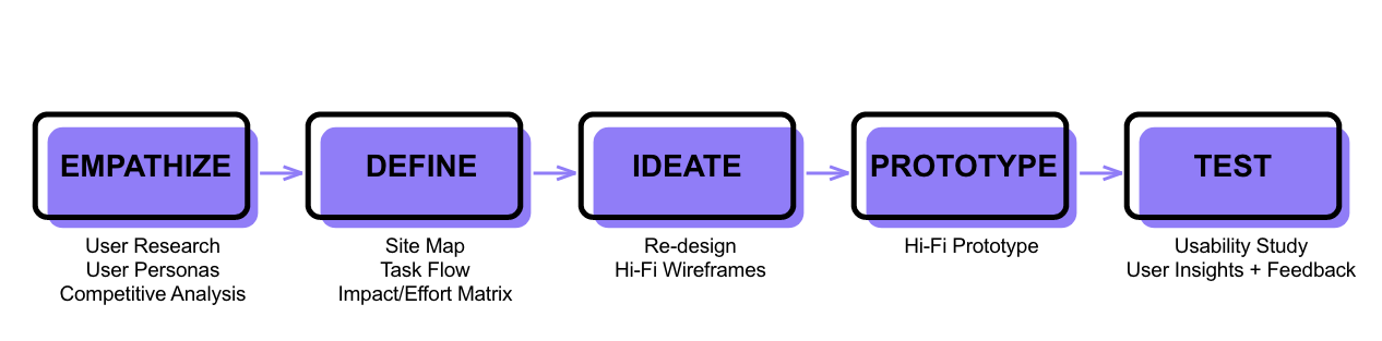
Understanding PM Biomedical
Stakeholder briefing:
Stakeholders are aware of the reasons to the increased bounce rate and cart abandonment, such as:
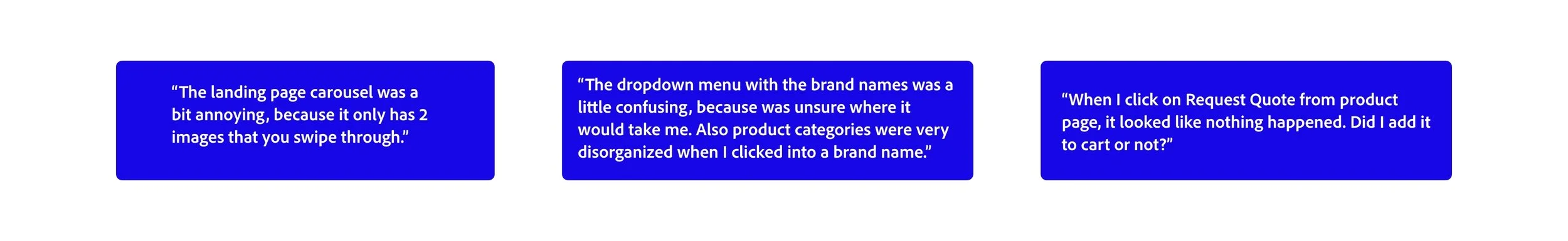
Unintuitive “Request Quote” CTA button on product page.
Checkout item list does not match Cart item list, thus misleading and confusing user when attempting to complete Quote Request Order.
Visual Hierarchy issues
Product page descriptions and features were too brief on many of the products.
Current Competition
Once I familiarized myself with my client, I researched its competitors.
I specifically selected the below companies, because they possessed the following characteristics:
Small to mid-sized business that offered the same products and services.
Most competitors’ user flows had intuitive navigation.
Clear information hierarchy
Smooth interaction and user flows.
Examining these competitors' features gave me valuable insights into successful attributes and areas needing improvement.
Key Findings:
Competitors had call-to-action elements that were strategically placed to enhance user experience.
Detailed product pages with beautiful product visuals.
Many competitors had an innovative and state-of-the-art feel to their visuals.
Some competitors had unintuitive user flows and navigation.
Most competitors included videos that highlighted their services or how certain products function, providing the user an enhanced and engaging experience.

User Interviews and Testing:
My next step was finding participants to conduct user testing on so I could observe how users presently try to navigate and carry out main user flows.
Challenges/Constraints:
It was a bit difficult finding the actual user of these services. Not only did they need experience working in healthcare, but also had to be familiar with the ordering process patient monitoring equipment.
I took it upon myself to conduct field research and contact a small health clinic and speak with a hospital administrator who was able to refer me to the right people that represent the target user.
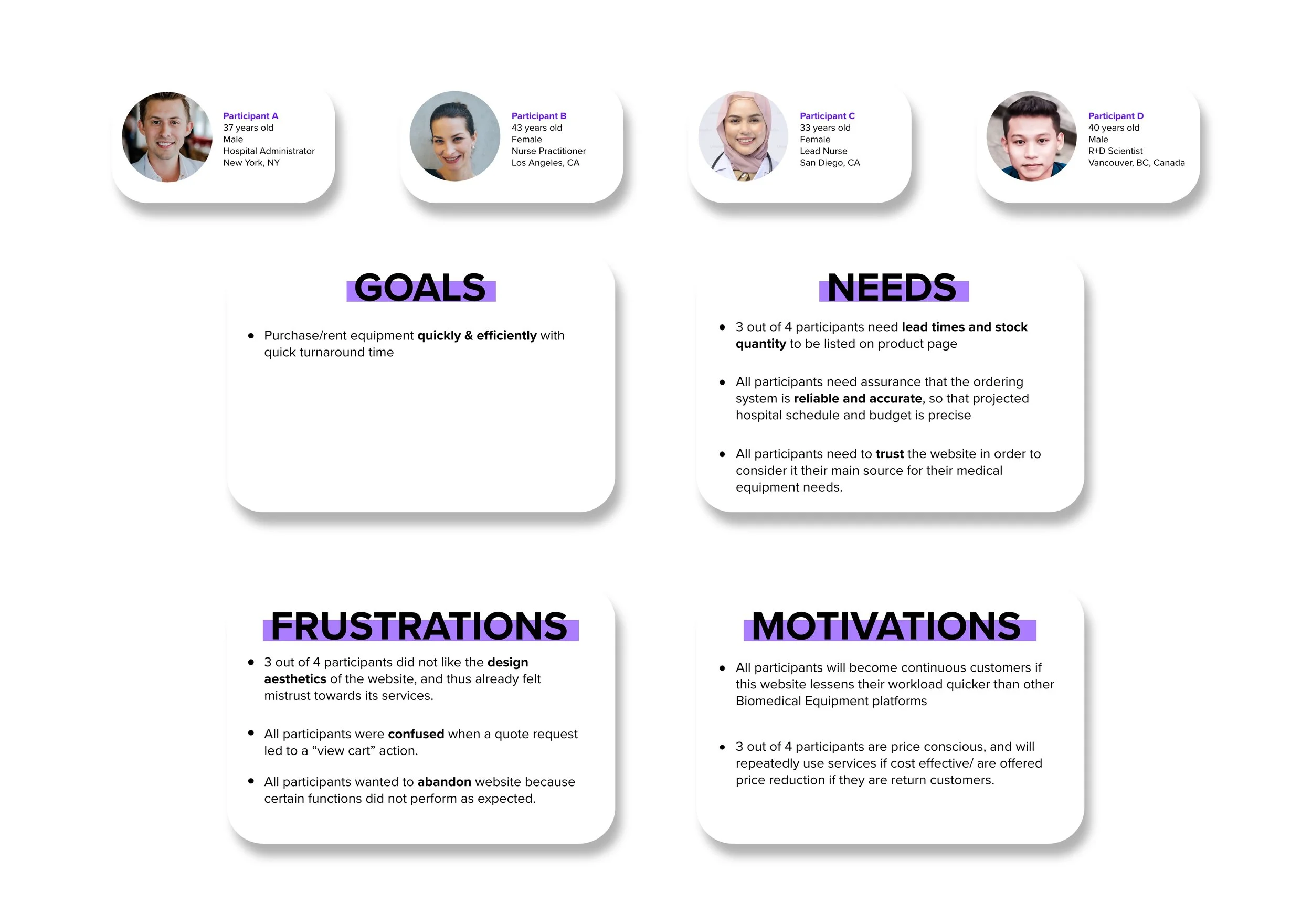
User Persona
My insight tells me that common users are mainly healthcare or pharmaceutical workers, who access this service through desktop, hospital computer system, or laptop. By understanding their frame of mind, I can take them out of this negative experience and onto the happy path.

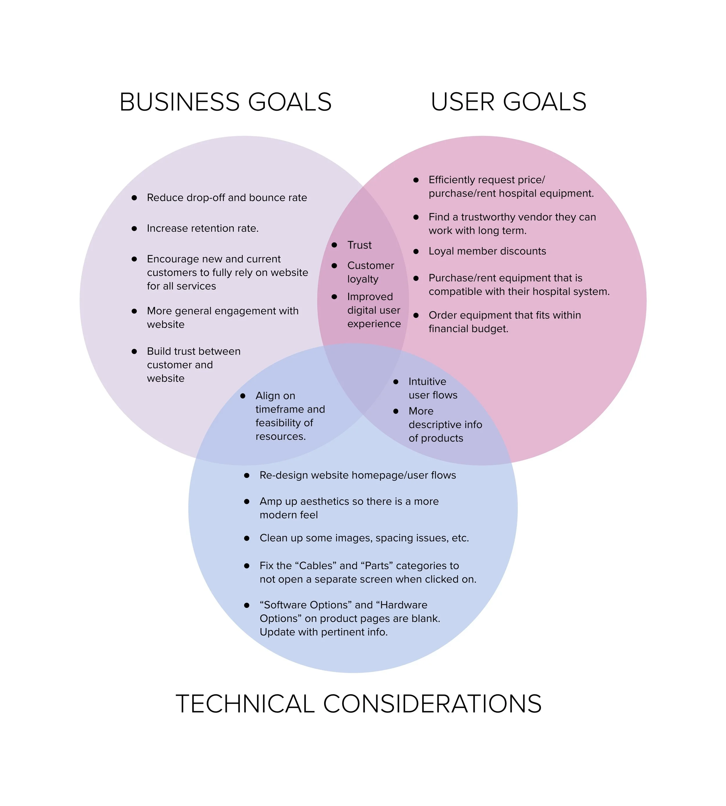
Project Goals
Based on my conversation with the stakeholders and the user test research, I mapped out the business goals, user goals, technical considerations, and the shared goals to prioritize the re-design.
Impact/Effort Matrix
In order to prioritize the workload to be completed within the given deadline, I organized all the features based on levels of impact and effort and reviewed with the stakeholders to align.
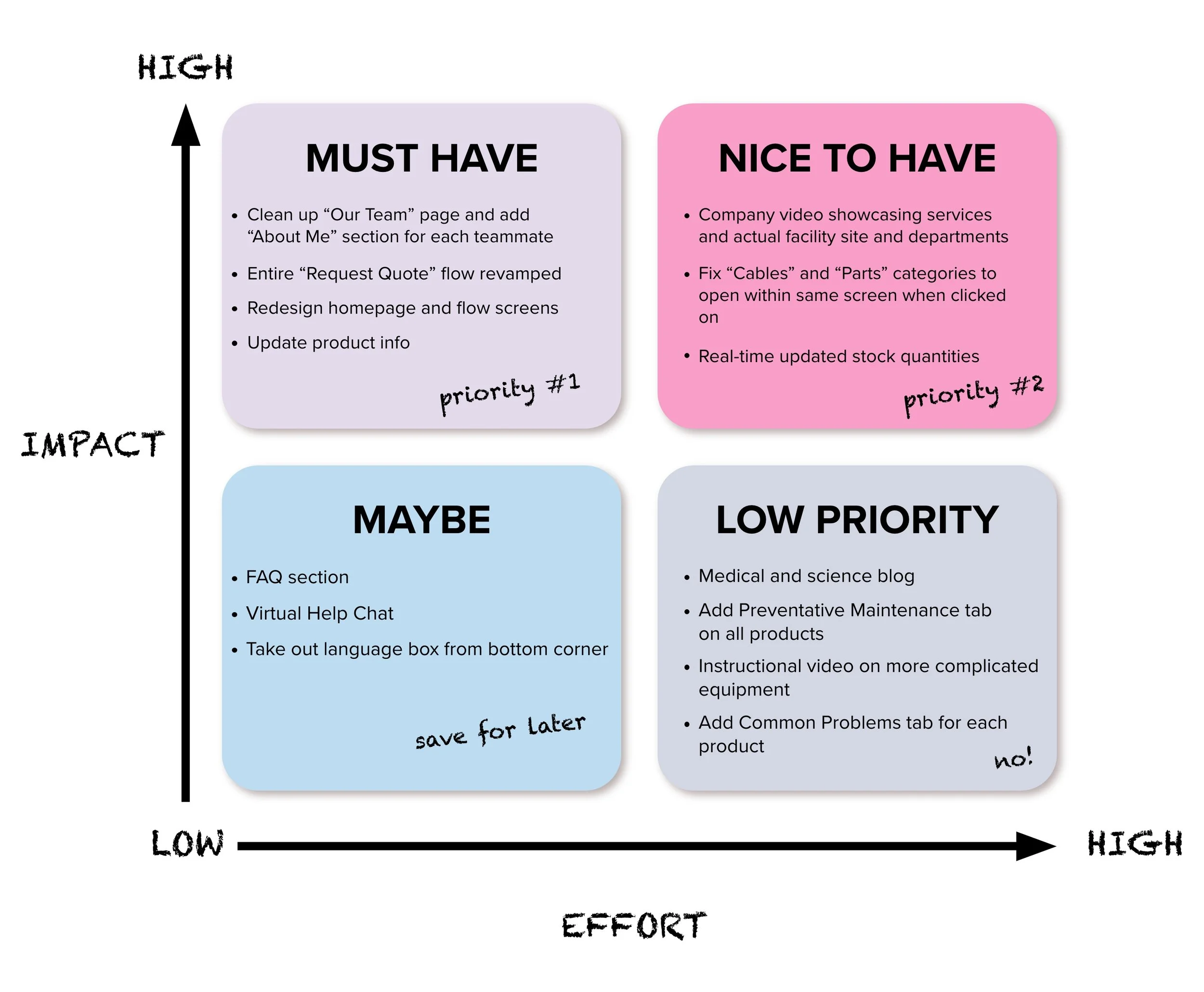
Key Takeaways
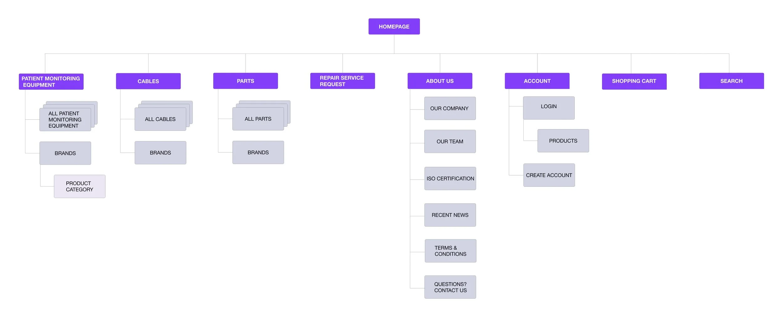
Site Map
I laid out the information architecture based on information from my Impact/Effort Matrix. 50% of my participants preferred the products to be organized by brand name since that is how they filter through items when searching PME products on similar sites.
Re-design
Here are some insights based off of my user feedback during usability testing:

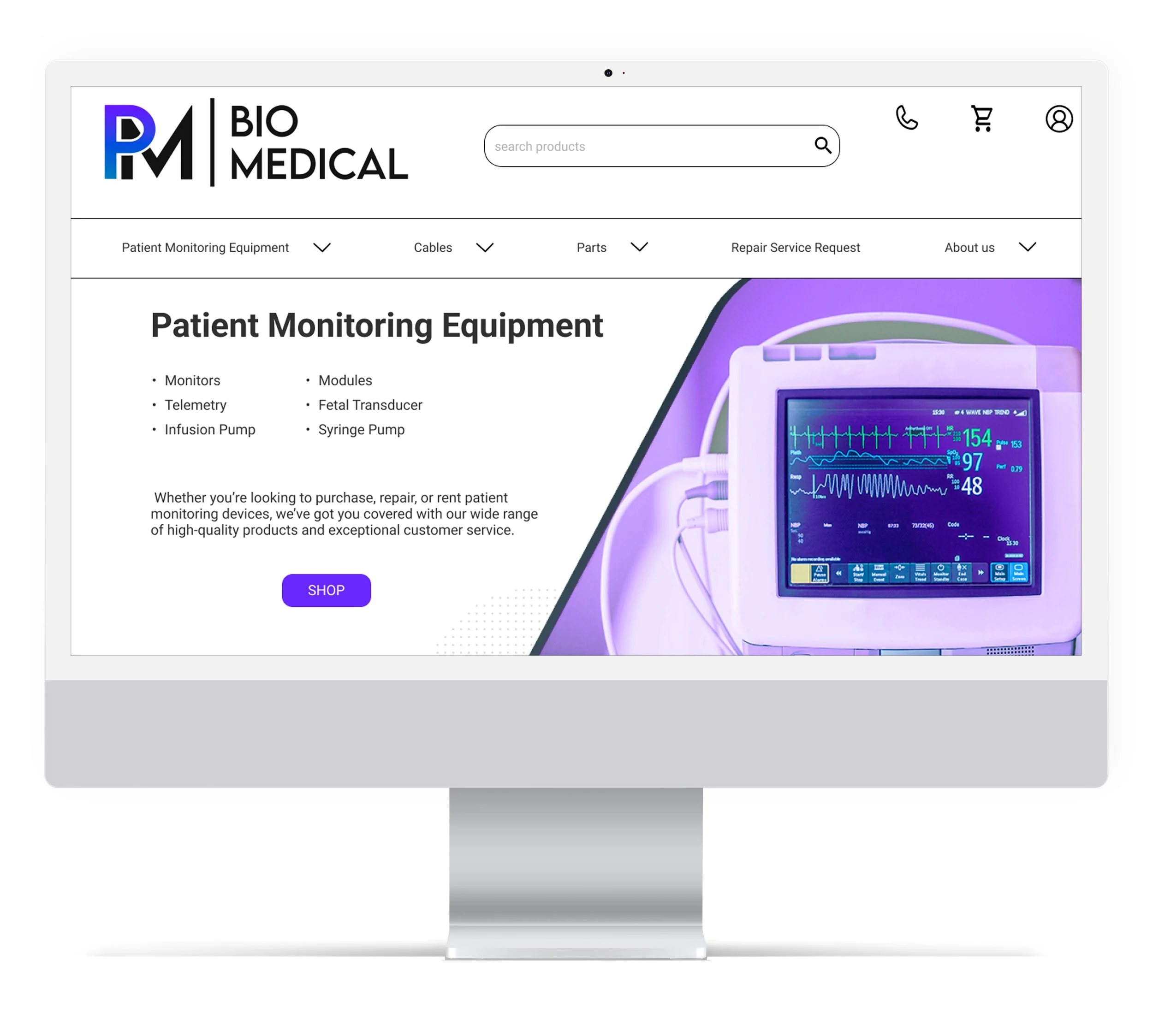
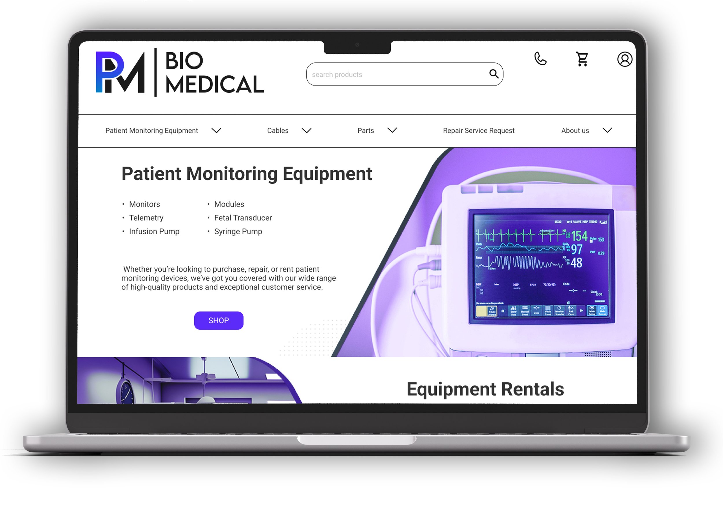
Here are a few of the landing page changes to note:
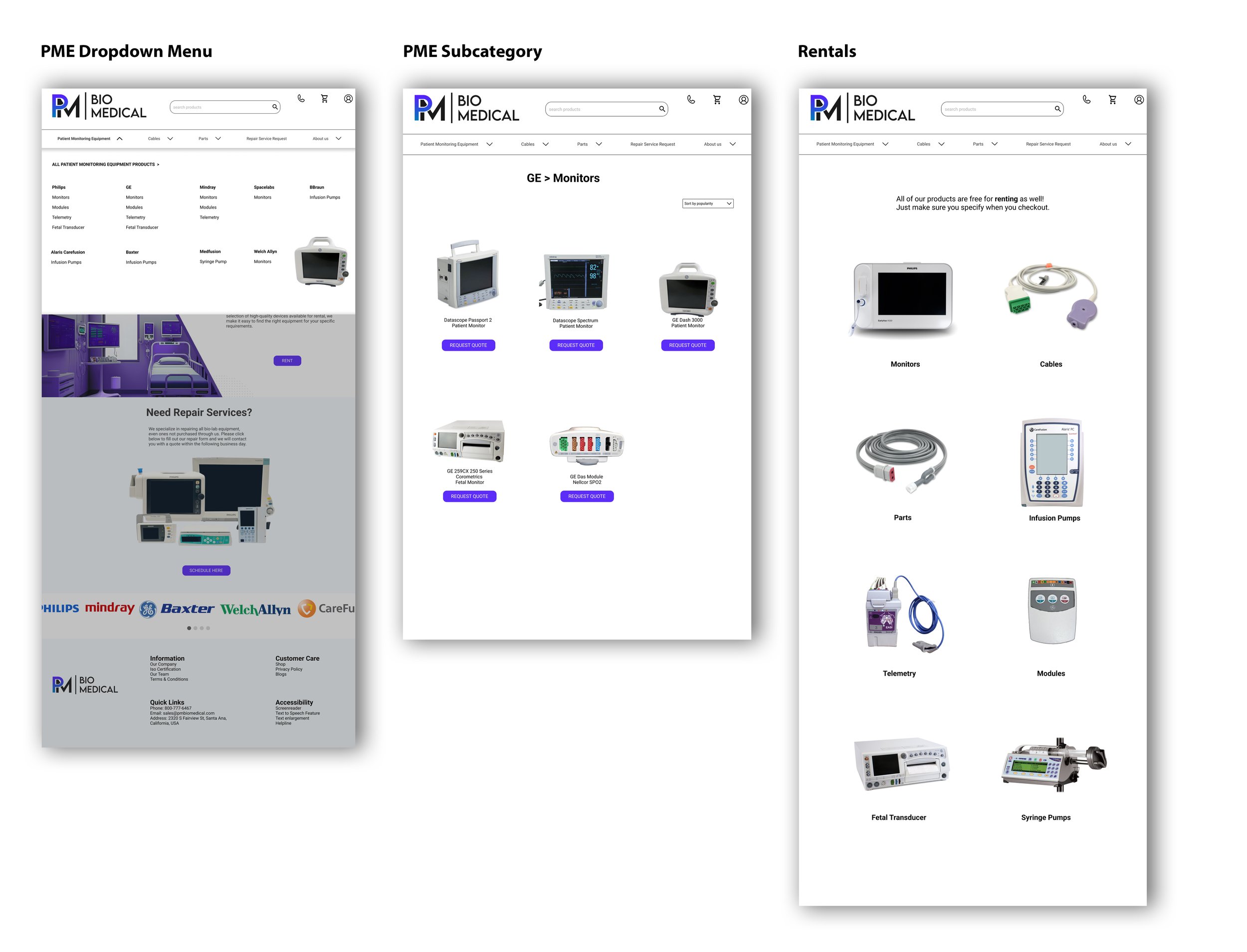
Hero carousel is now a hero image showcasing the featured product in a visually clear manner, and as you scroll down, everything is laid out with emphasis on information hierarchy.
Unnecessary images and info were taken out to give user a cleaner UI and smoother navigation.
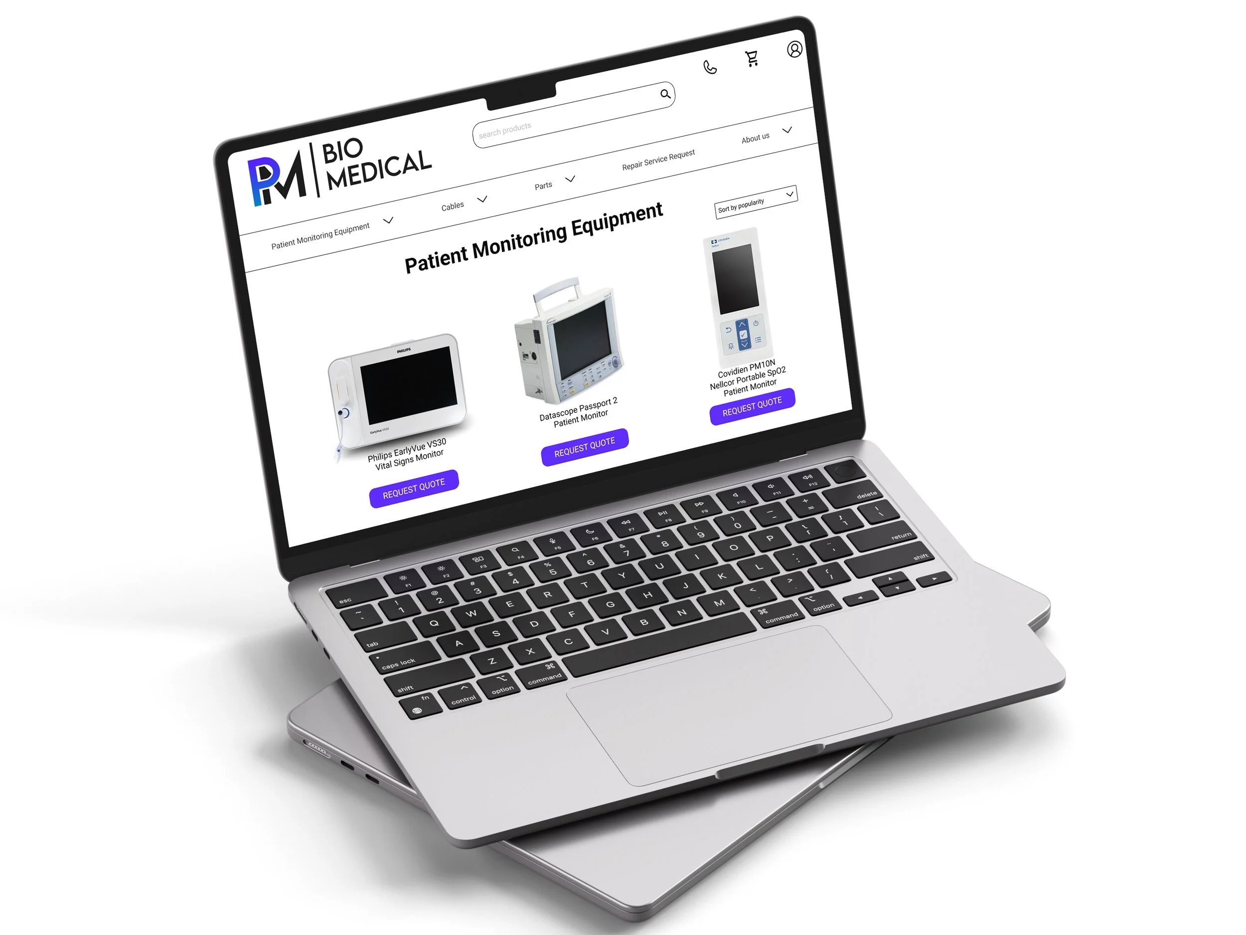
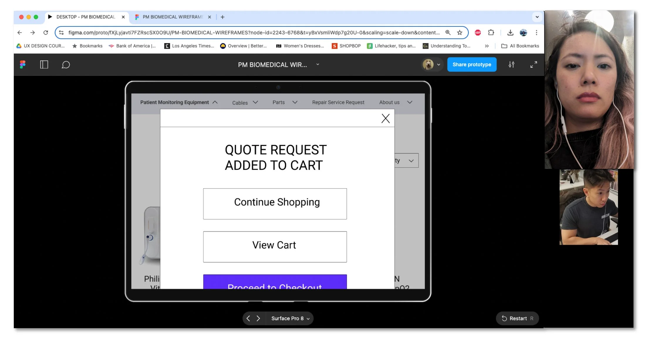
CTA buttons on product list and product page will open a dialogue box with options to continue shopping, view cart, or proceed to checkout.
Hamburger menu will be omitted.
Main product category, PME, will be organized by brand name and PME category.
Here are the polished screens with some of the design changes:

Usability Testing
It was time to test overall usability of the re-designed pages and whether they meet the goals and needs of the users.
Participants
Early 30’s to early 40’s healthcare workers who have ordered biomedical equipment as part of their job duties.
Objectives
Test the general ease of the redesign (landing page, quote request navigation, layout, look & feel)
Do users feel the main quote request checkout flow makes sense?
Do they feel confident when requesting quote/purchasing/renting from the site?
Was the redesign effective?
Have I resolved any challenges/issues the user faced from the old design?
Task: To request quotes on several products
RESULT
Based on user test findings, Price Request Flow was more smooth and intuitive to complete
Users were able to complete the main Price Request Flow faster and with less clicks
Data suggests that conversion rates increased by 50% after redesign was implemented
Feedback:
“Huge improvement from the original website!”
“I like that you can add items from the cart since I tend to forget parts that go with the machinery.”
“I have more trust in this company’s products and services now.”
Impact:
All participants that tested have stated that the user flow is much better than original website.
3/4 participants felt they had more trust in this company and its services after the changes.
3/4 participants thought the re-design was cleaner and had a more “state-of-the-art” feel to it.
All participants were happy that the brand names hamburger menu was taken out, since it was confusing. It made much more sense to integrate the brand names within the product category.
What I learned:
Some people do not like scrolling too far down the landing page due to cognitive overload. It’s best to try to fit the most important info within the parameters of the first few mouse scrolls.
Limitations:
Had to design within the stakeholder’s color theme, UI elements, and original landing page photos. I had to try to elevate the layout and look of the website with what available photos and styles they in their database.
Stakeholders require that the end product works within the constraints of the Wordpress template they had initially purchased for the business.
Not enough analytic data at the time, on Wordpress - Google Analytics business platform, to determine quantitatively if cart abandonment rate decreased. However, data suggested that conversion rates had increased by 50% after the re-design was implemented.
Limited availability of actual users of this product.
Next Steps:
Re-test to make sure site is responsive across desktop, tablet and laptop devices.
Check analytics (when available) to see if website re-design achieves the goal of reducing abandonment cart rates.
Update Team page to be more descriptive and visually attractive.