

Reality AI
Streamlining educator tools to optimize teacher workflow
Company Overview
Reality AI is an open-source SaaS EdTech AI Learning platform for educators that saves time, prevents teacher burnout, and enables teachers to focus more on providing students with a more enriching and engaging educational experience.
Key Stakeholders
CEO + CTO
My Role
Product Designer
My Team
Lead PM, Dev Lead, 1 Senior Product Designer
Timeline
3 months
What problem are we solving, and why does it matter?
The Problem
The current implementation of Tools Discovery and Tools History exists as sections with no clear separation. While tools history serves as a storage area for past outputs, it lacks integration with the primary tools page and advanced filtering options, making it harder to manage and locate specific outputs. The users, primarily teachers, are experiencing some difficulty discovering relevant tools and accessing history outputs, which results in lower engagement and unnecessary clicking.
Impact
The disconnect between tools and their history adds unnecessary friction to educators’ workflows. Without proper organization and filtering, educators struggle to efficiently reuse their work, reducing the overall value of the platform.
Result
Time on Task rates were reduced and Task Completion Rate improved, however, final product needs more rounds of user testing and refining.
Understanding the User’s Needs
I led the user research where I conducted some user surveys to discover common pain points teachers have navigating EdTech tool platforms similar to this one. I synthesized common themes and patterns I had gathered, into user stories.
As a user (teacher), I want to:


Key Insights:
Not all teachers (users) are “tech savvy”, thus features, buttons, toggles, etc. cannot be too complex or advanced.
Having two “Sort By” and “Search” filters on the same page was confusing for the user and led to excessive clicking.
Users like having their most frequently used tools appear on screen first, followed by the rest of their more general categorized tools.
Original Tool Discovery/History Page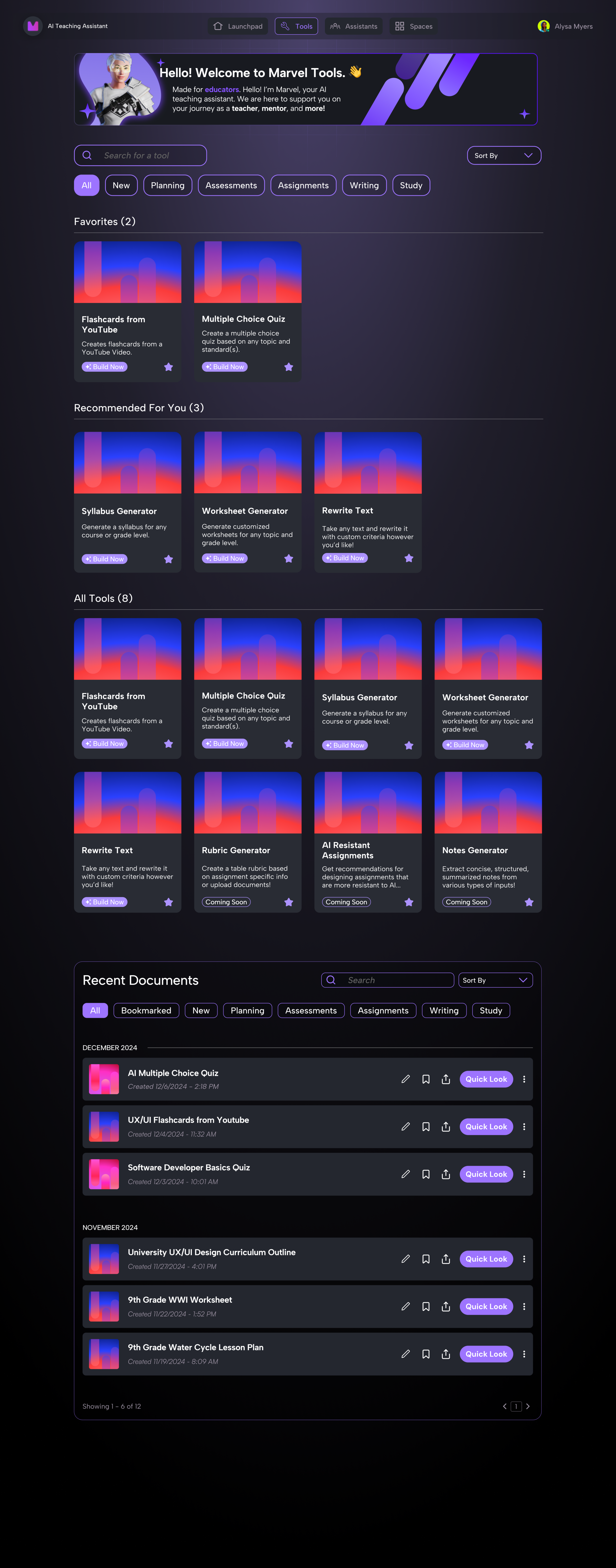
Design Approach + Iterations
Based on insights and inputs, my team set out to propose features that would help solve these issues and provide a more seamless user experience.
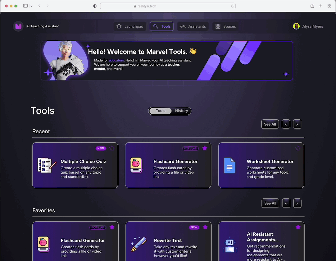
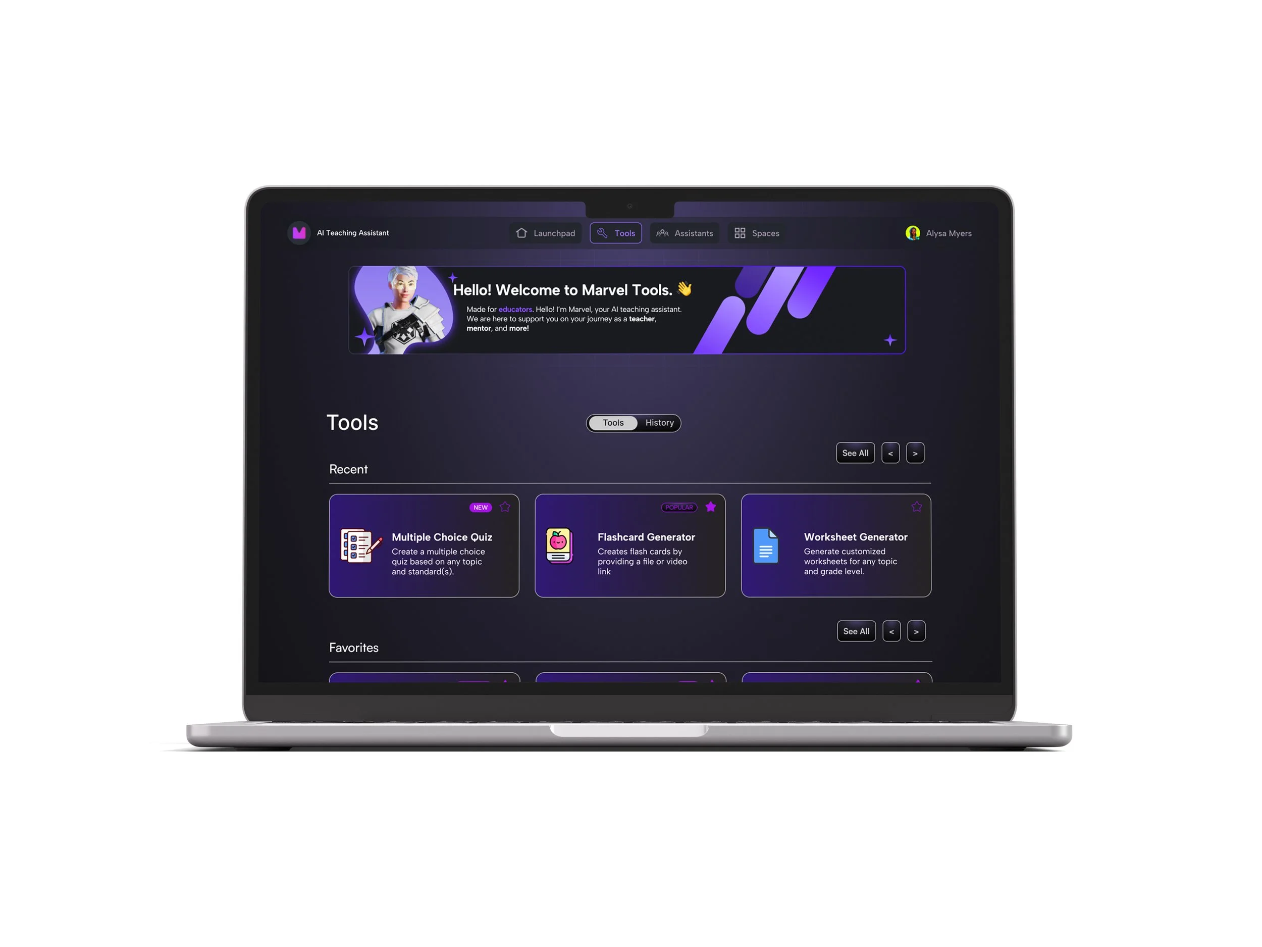
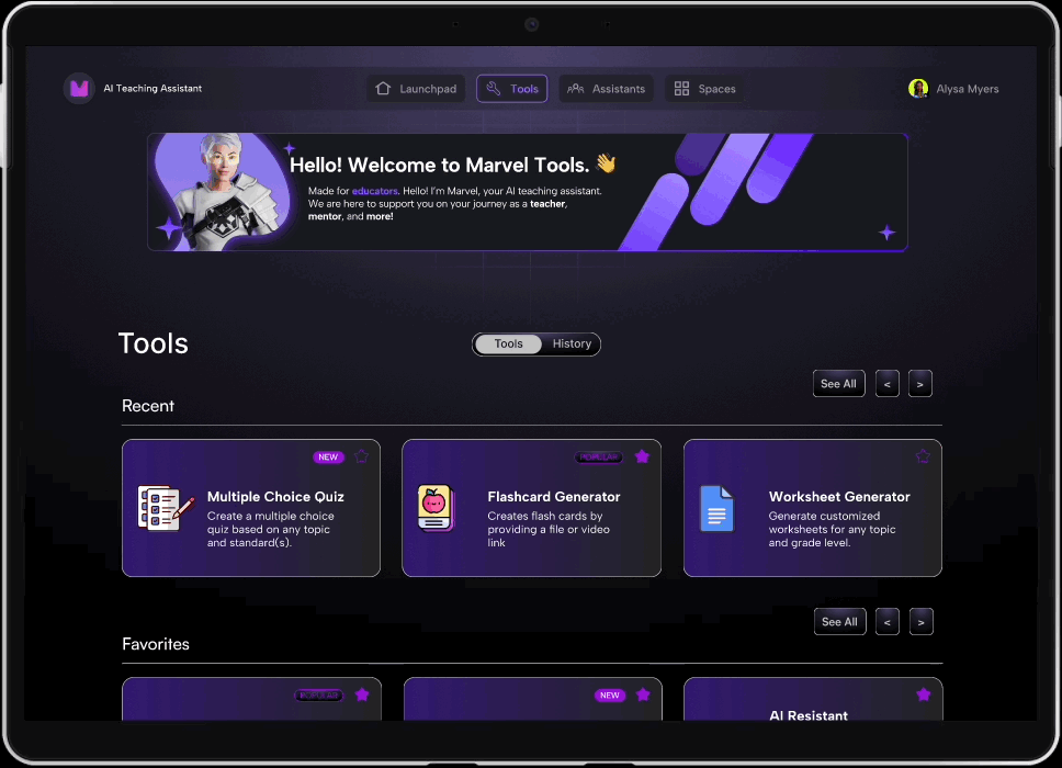
#1: Clear separation of tools and history pages
We compartmentalized the tools from history output, through a toggle feature. This enables user to seamlessly switch back and forth between pages as needed, without disrupting work flow.
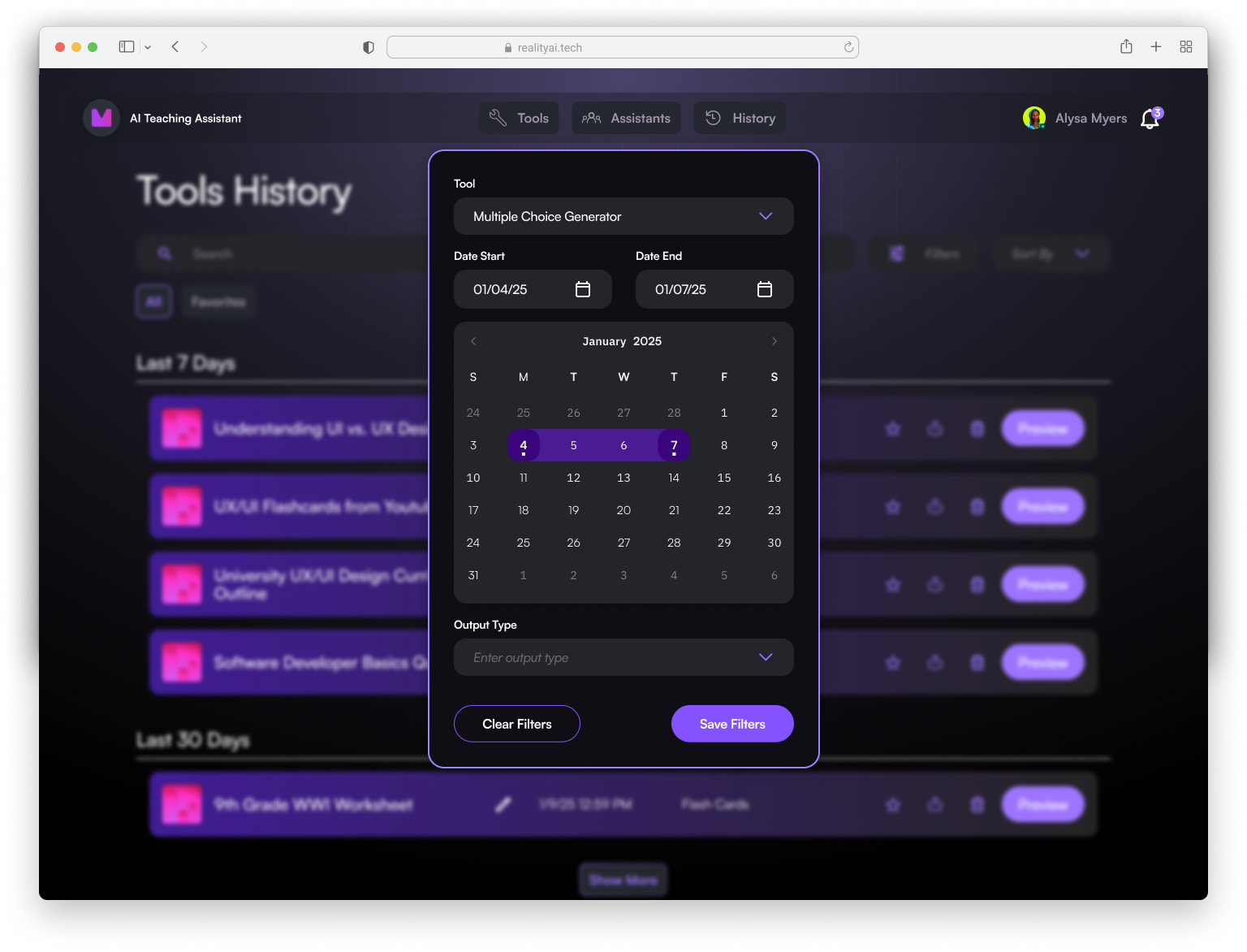
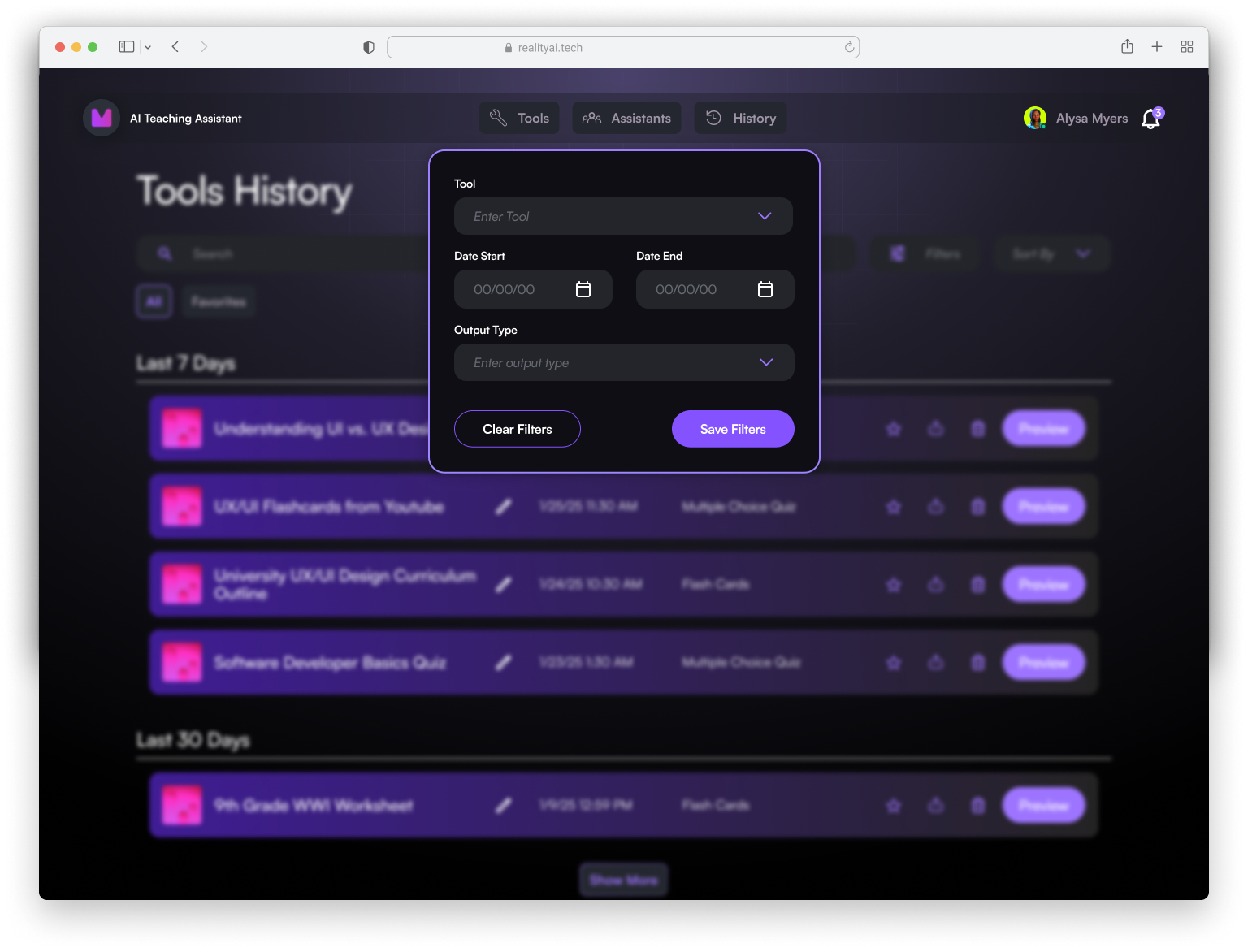
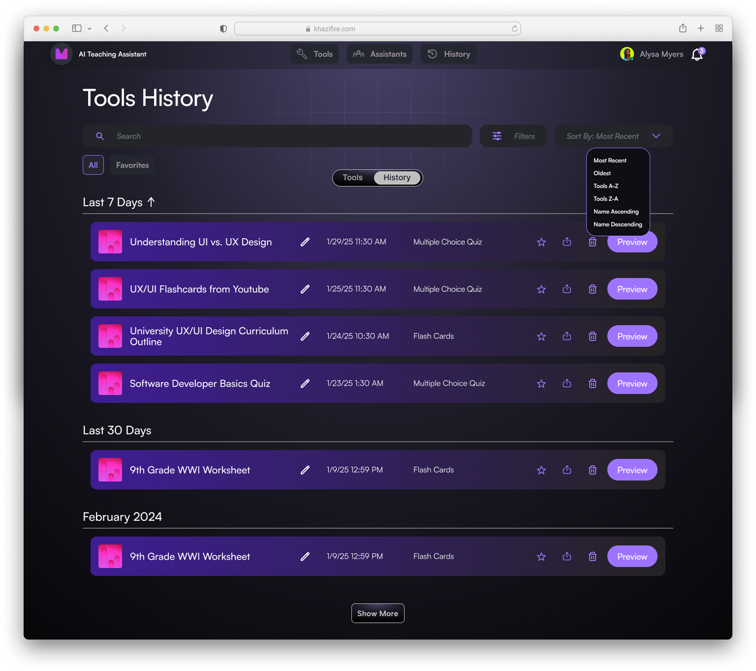
#2: Separate Tools History page with advanced filter system
The tool history output page will house many files over time, thus a dedicated filtering system that can search by date range, tool, file type can enable user to refer to old versions of frequently used documents such as quizzes, tests, syllabuses that need updating or revisions. User is able to quickly filter, preview, edit, and export their past outputs quickly.
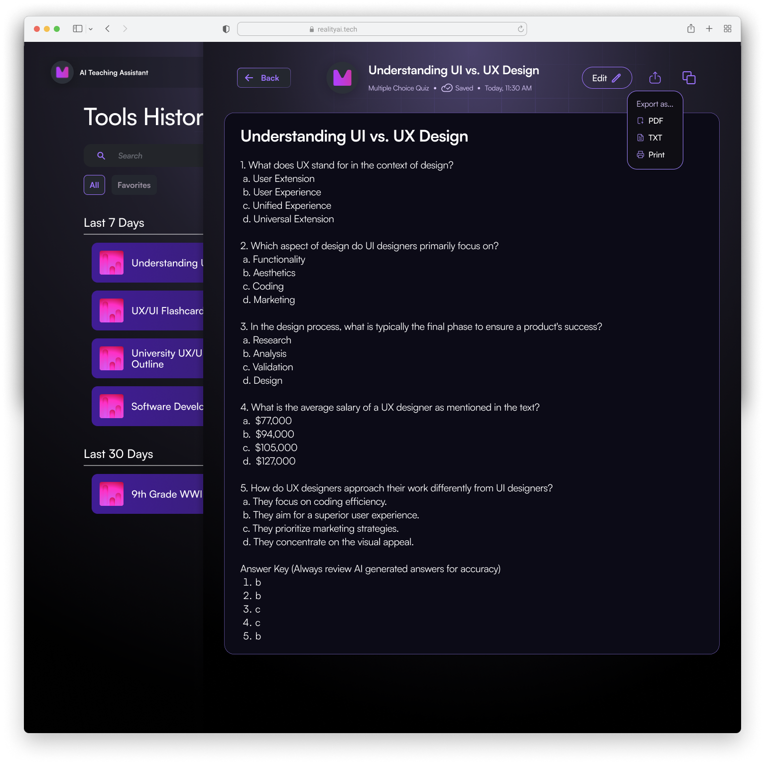
#3: Easily accessible file export function
Once user accesses chosen file, export icon is easily viewed at the top of the page, with options on preferred action displayed as a dropdown menu.
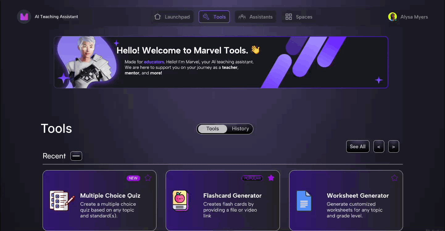
FINAL REDESIGN
Testing Iterations with Users
Key Insights:
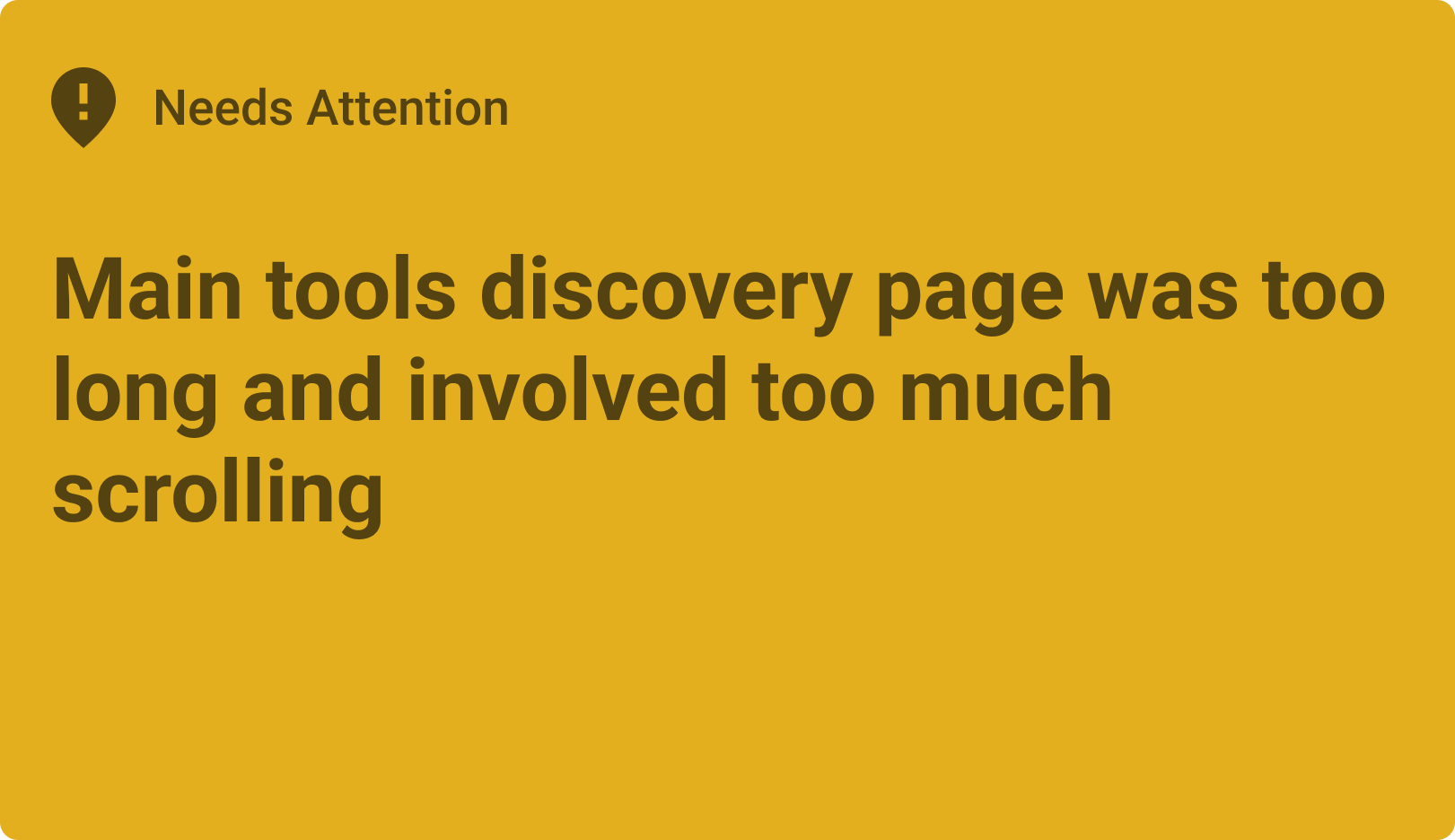
Biggest iterative design change
In order to remedy the issue of too much scrolling on main tools discovery page, we enabled user to have the option to minimize “Recent” and “Favorite” tools, while still being able to easily view them again if desired.
Retrospective + Key Learnings
1) Lead with research and testing
Without surveys and testing, I would potentially have redesigned something with overly complicated features that would not serve the older demographic of my users. Understanding my user base holistically, both qualitatively and quantitatively, allows me to focus on creating a product that provides a streamlined and enjoyable experience for all users of diverse backgrounds.
2) Get feedback early and often throughout the process
Being on a small startup team was a great opportunity to work directly with stakeholders. Involving stakeholders earlier on reduced the amount of rework I had to do. Every design iteration had to balance user needs with business goals; consistent communication helped my team and I achieve this equilibrium.
3) Test quantitatively for next steps
I'd start testing how well the features match the needs of the users, how it currently gets used, and how well it achieves it’s aims.