

Mindful Therapy
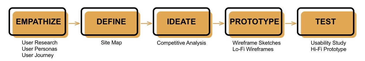
Designed an end-to-end responsive online therapy platform that integrates tools and features to make mental health care more convenient, accessible, and user-friendly.
Goals:
Design an accessible online mental health platform that allows users to seamlessly and conveniently receive therapy services.
Role:
UX Designer
Duration:
3 months
Tools:
Adobe XD
Miro
Illustrator
Photoshop
Google Workspace
Zoom
Problem
It is estimated that more than one in five U.S. adults live with a mental illness (more than 50 million Americans to date).
Factors that contribute to the Americans’ lack of therapy treatment are as follows:
42% said they cannot afford mental health care.
17% said their health insurance doesn’t pay enough for treatment.
29% said it’s hard to find a therapist they are compatible with
27% are unaware of where to get help
19% do not have enough time to seek treatment
Opportunity
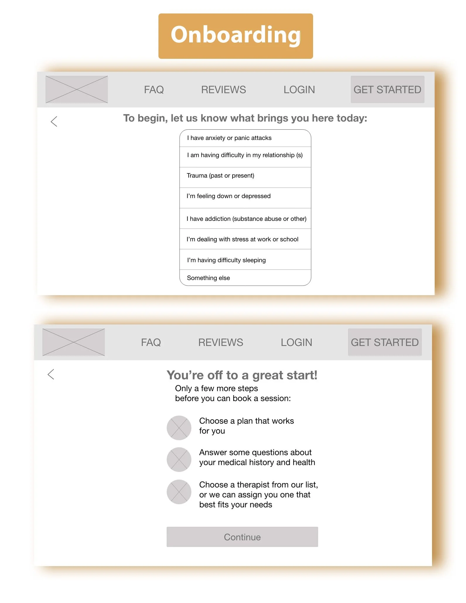
Mindful Therapy is a convenient and user-centered solution for therapy treatment that includes the following features:
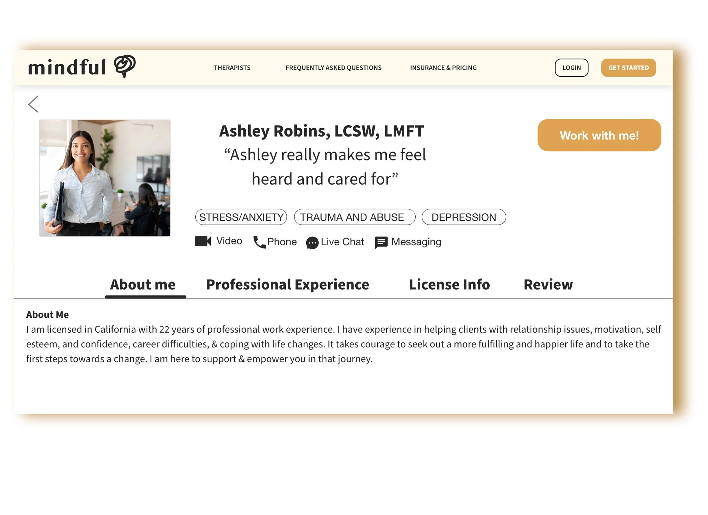
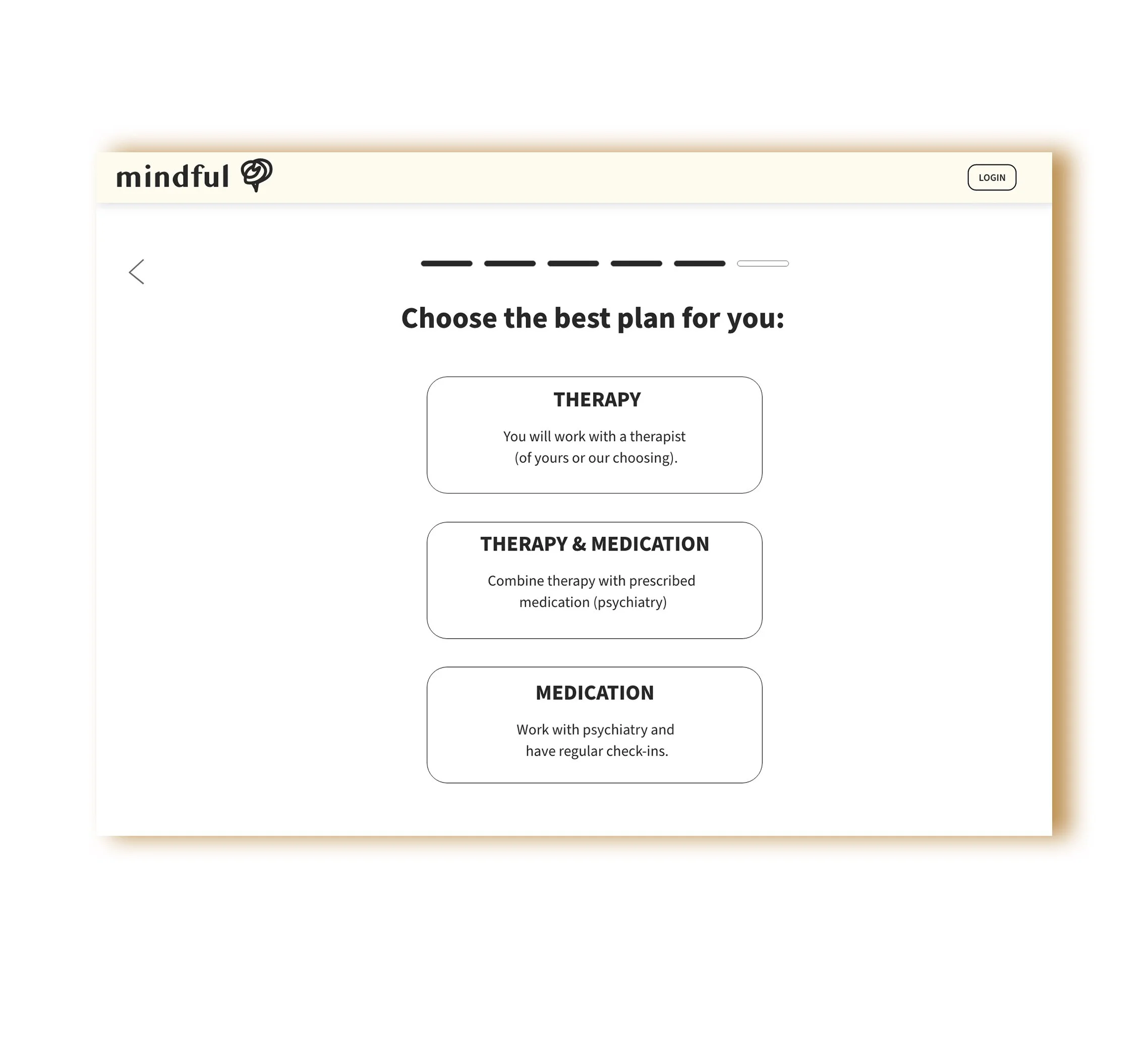
Easy to sign up, select a therapist, and schedule a video or phone appointment; all within the same flow.
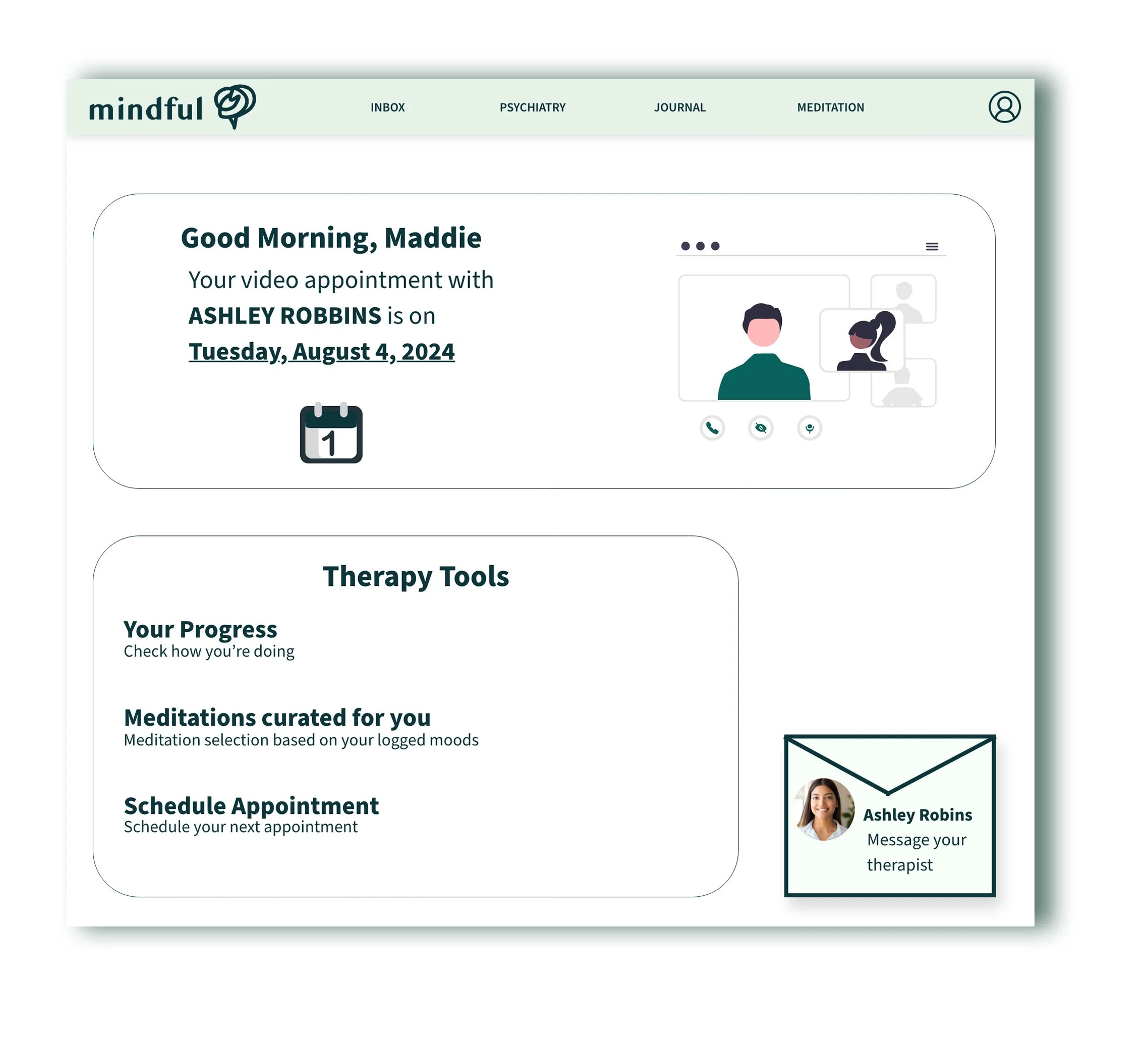
Switch therapists through app if user doesn’t feel they are a good fit.
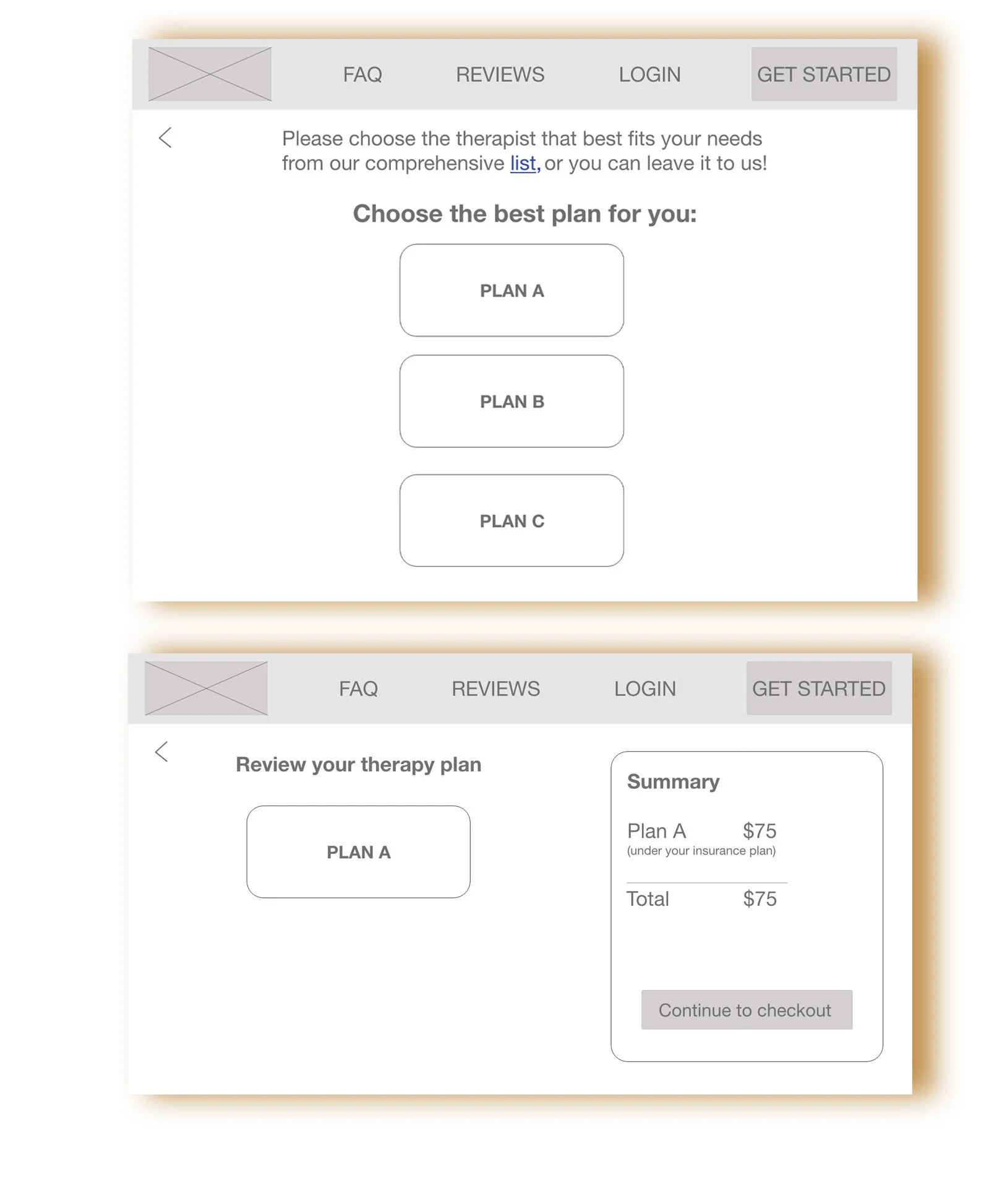
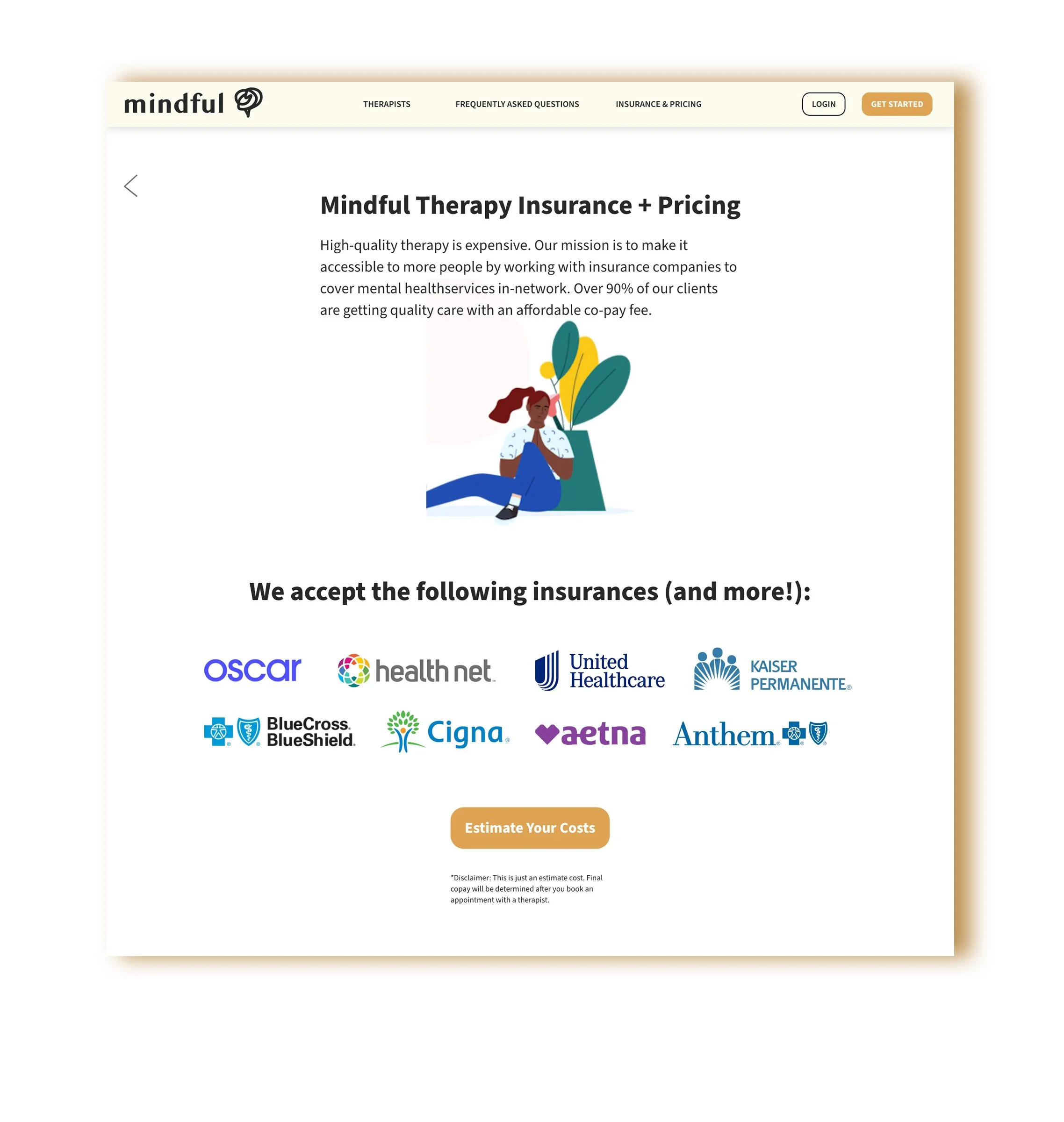
Estimated therapy costs are already provided from the homepage phase, letting user know what to expect before proceeding to onboarding.
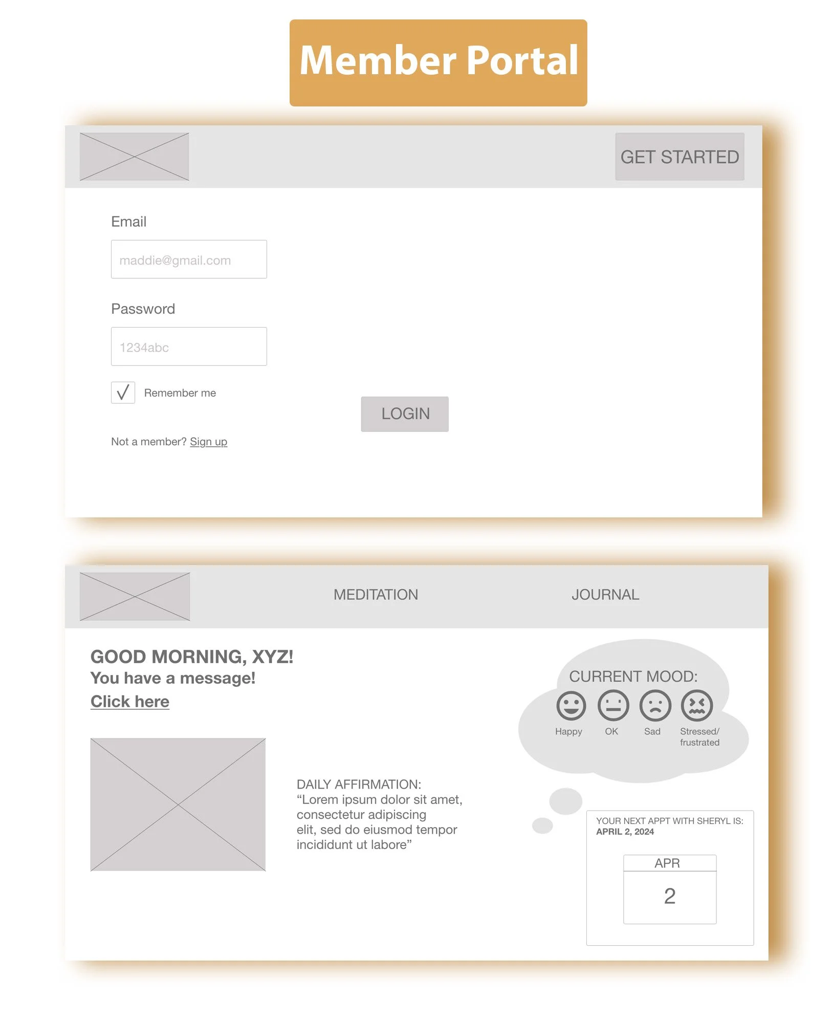
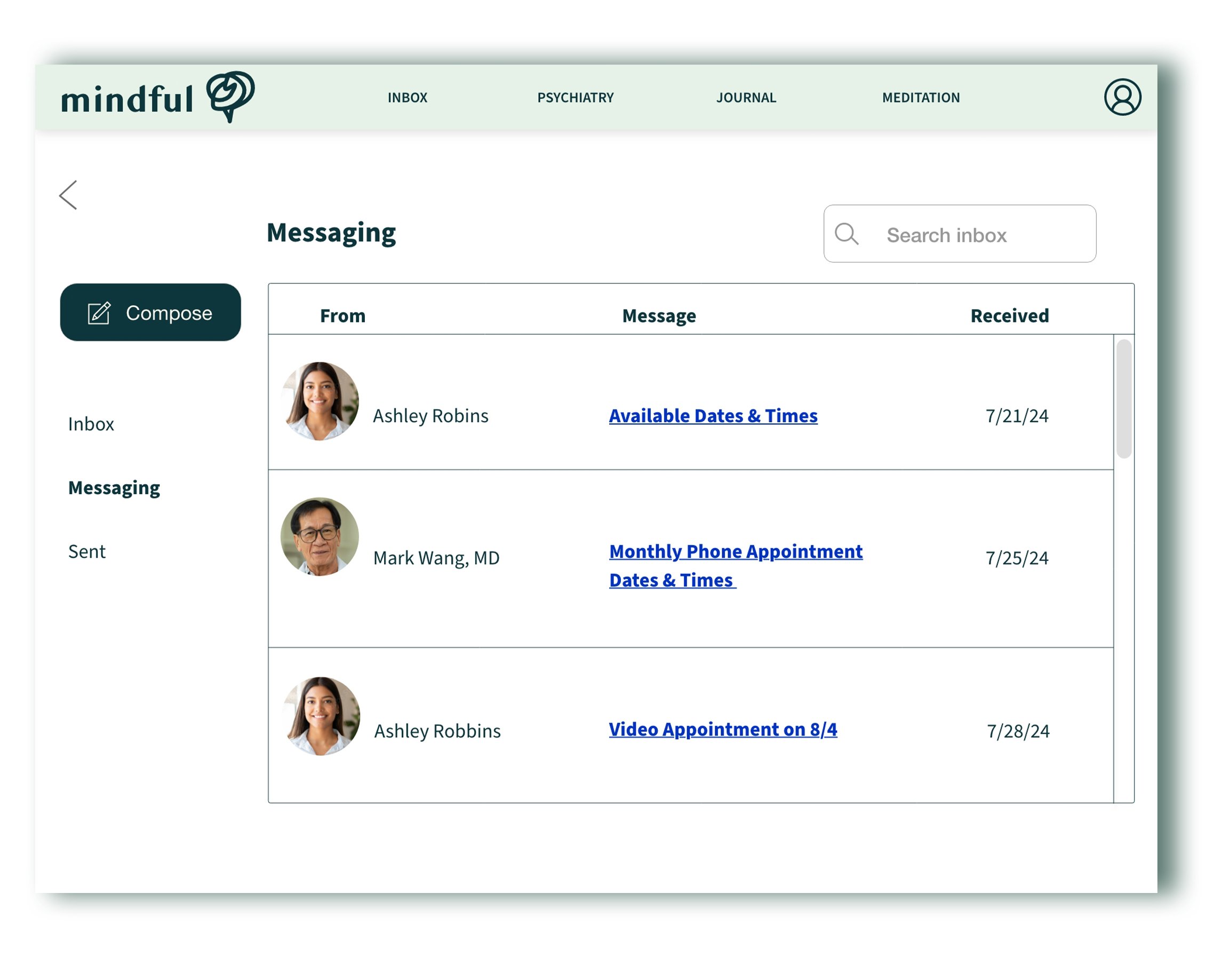
User is able to message therapist through the website or app when needed.
Research — Building user empathy
User Interviews (Screener survey)
Key Takeaways
All participants think mental health is just as important as physical health
All participants rely on word of mouth/reviews when choosing a service like therapy, while some focus mainly on the costs or what their insurance covers.
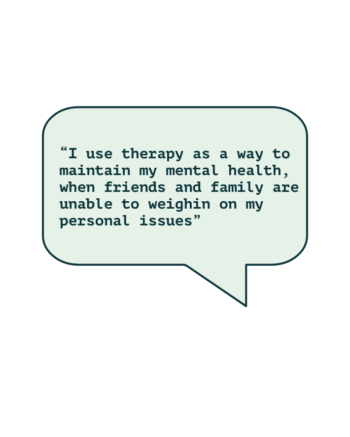
Some participants seek therapy just for overall mental health improvement, while some seek therapy due to diagnosed mental health disorders that require professional and medical treatment.
User Journey
I decided to map out a typical user journey from web search to therapy session to therapist switch, using one of the representative personas. I felt it more important to focus on the customer’s emotional journey rather than user flows and task flows.
This is a very sensitive journey for someone to go through, and I really wanted to emphasize the highs and lows they may potentially experience. Therapy is a very personal experience, and therapists are not a one size fits all service.

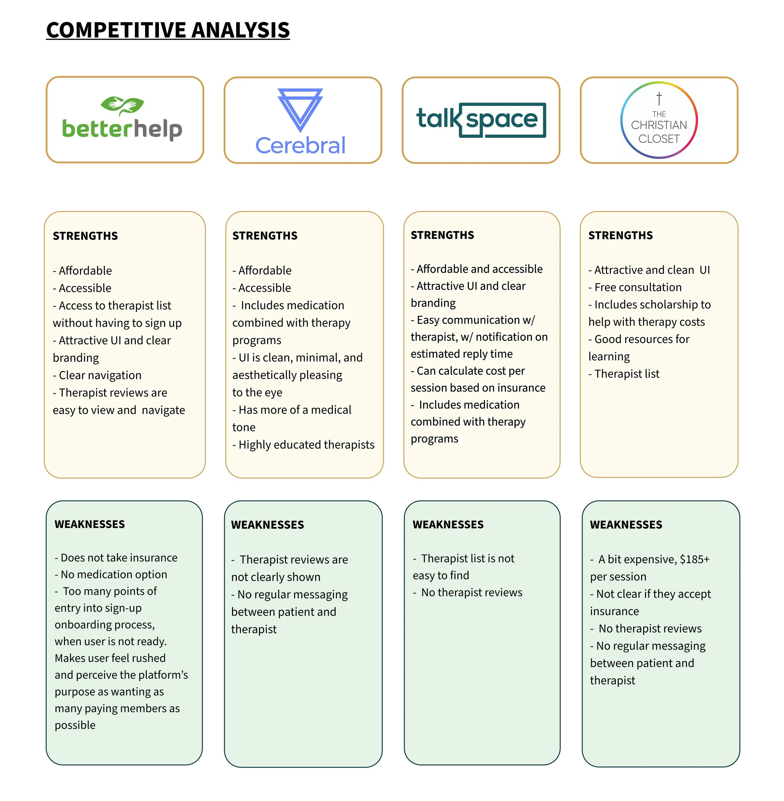
Journey for typical user searching for long-term therapistCompetitive Analysis - Learning from the competition
I conducted a competitive analysis to see what position in the market this product could fill. I made sure all competitors had the following attributes, which helped me identify strengths and weaknesses within the market.
Insights
Affordability/Covered by insurance
Clear navigation
Attractive UI
Most companies included regular messaging between patient and therapist.
Reputable mid-large sized companies.
2 out of 4 competitors combined therapy with medication.
2 out of 4 competitors had detailed therapist lists that were easy to locate.
Only 1 out of 4 competitors included user reviews for each of their therapists.
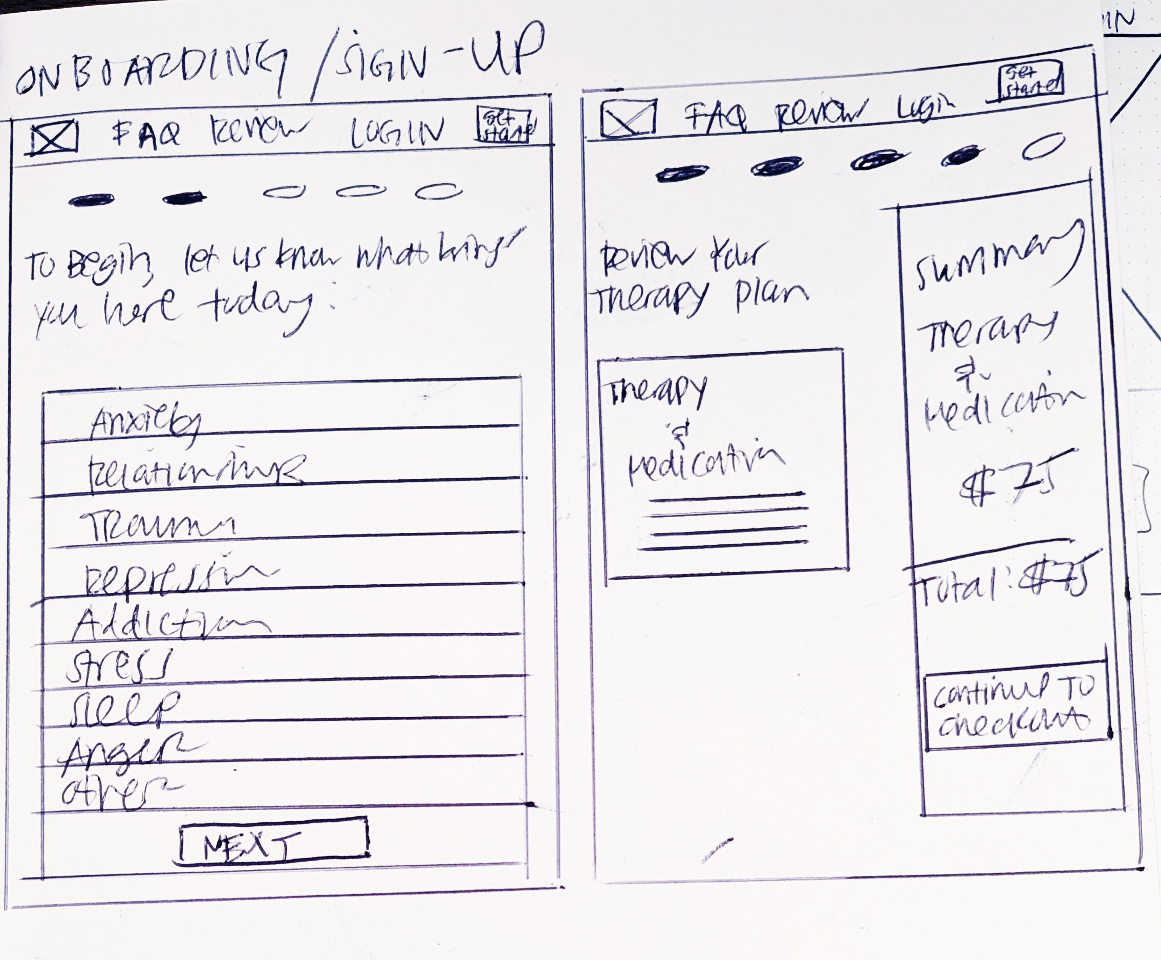
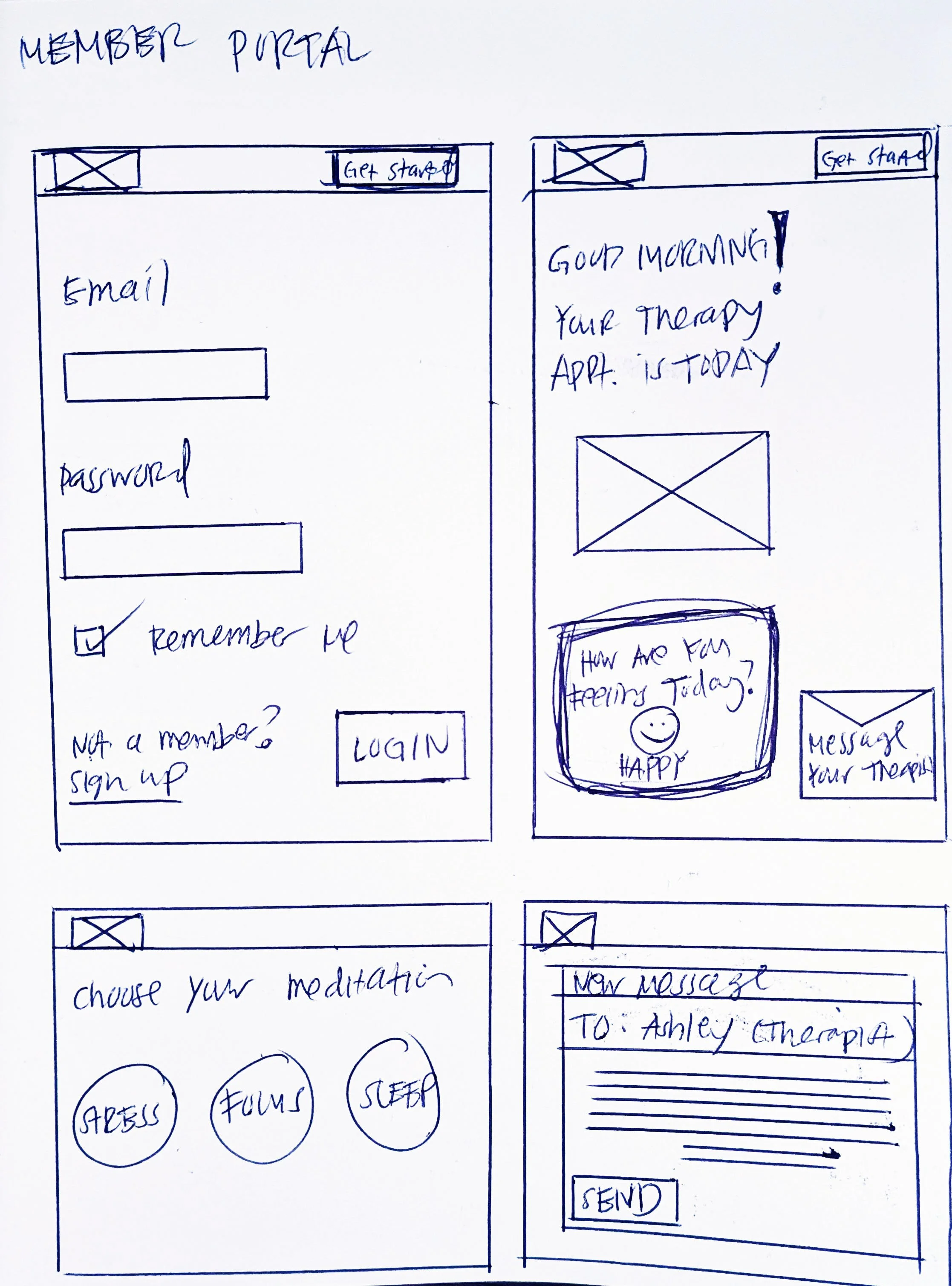
Wireframe sketches
Landing Page Features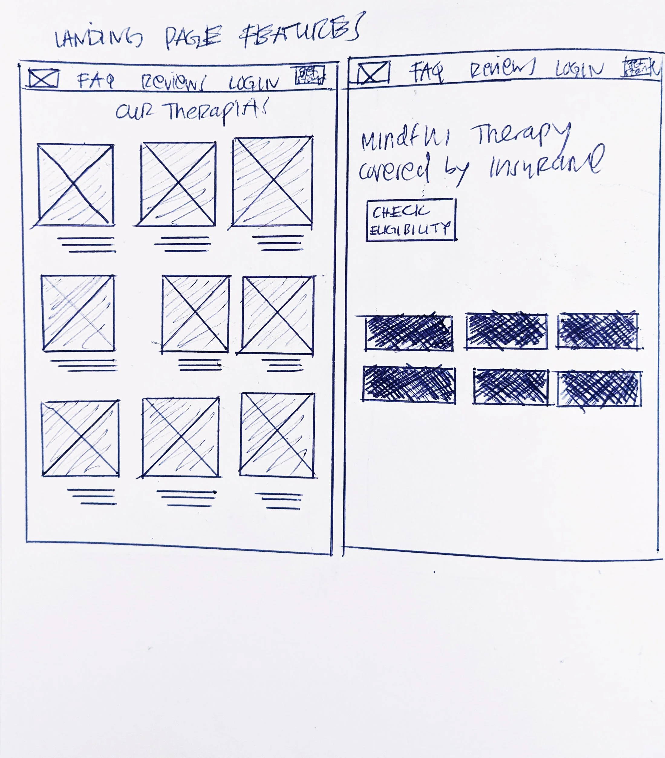
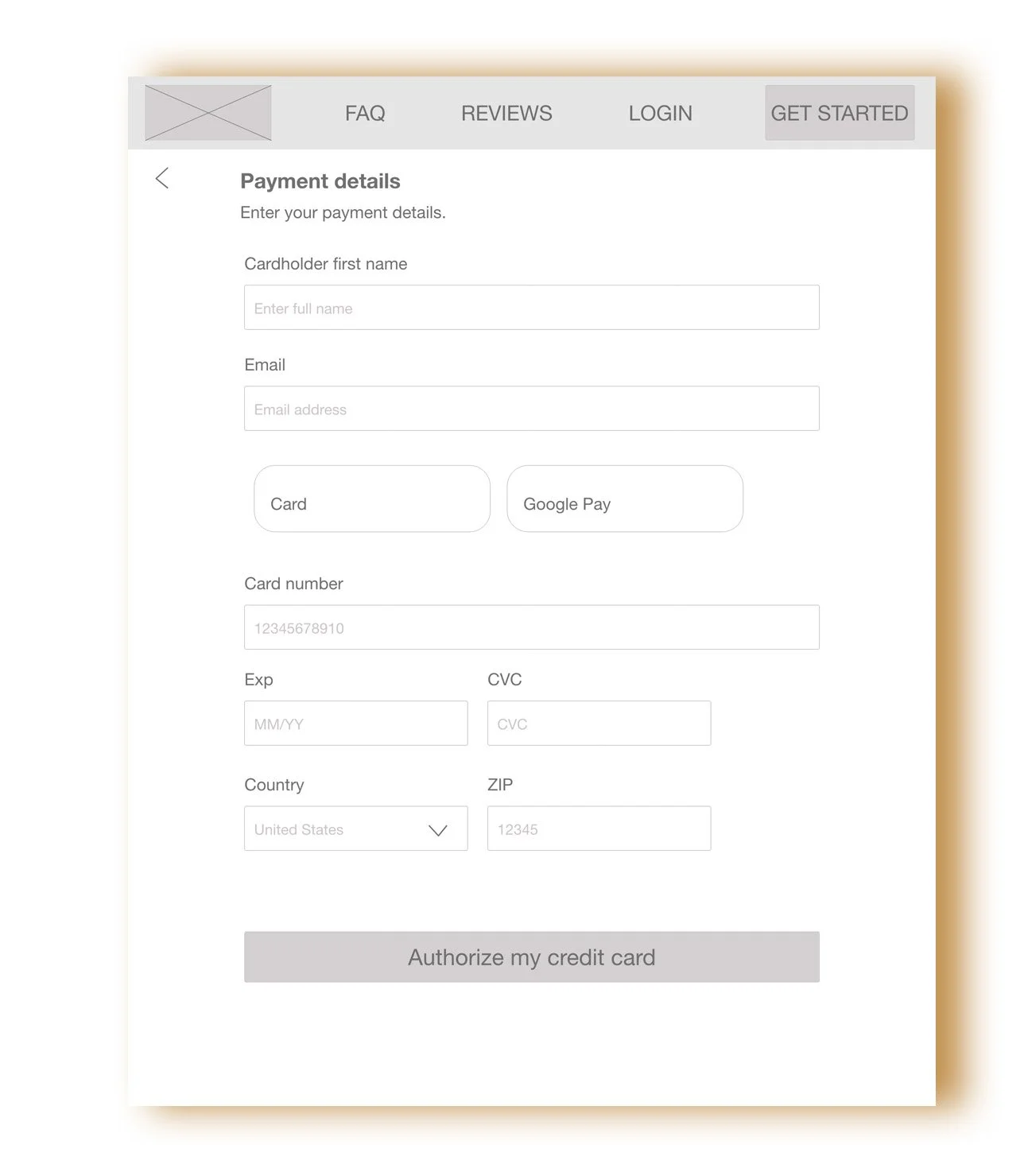
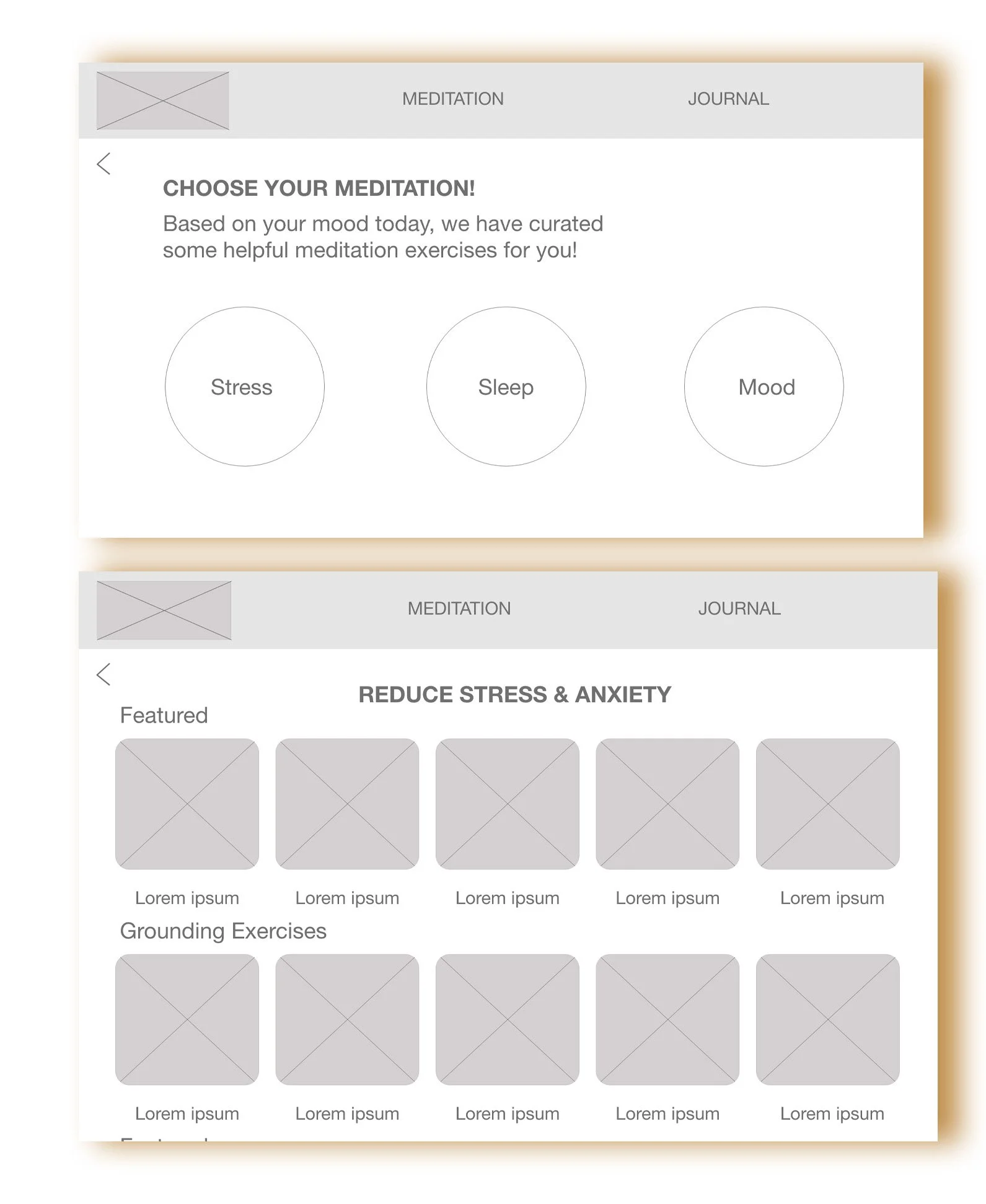
Member Onboarding
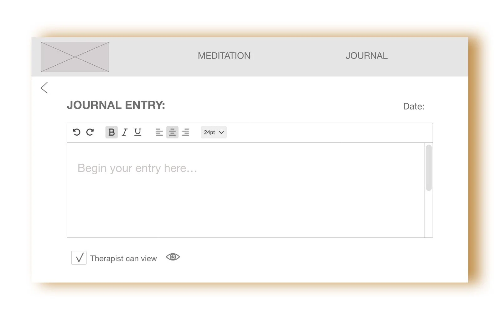
Member Portal
Low-Fidelity Prototypes
Moving onto digital lo-fi prototypes, I fleshed out the main homepage features, onboarding, and member portal screens.
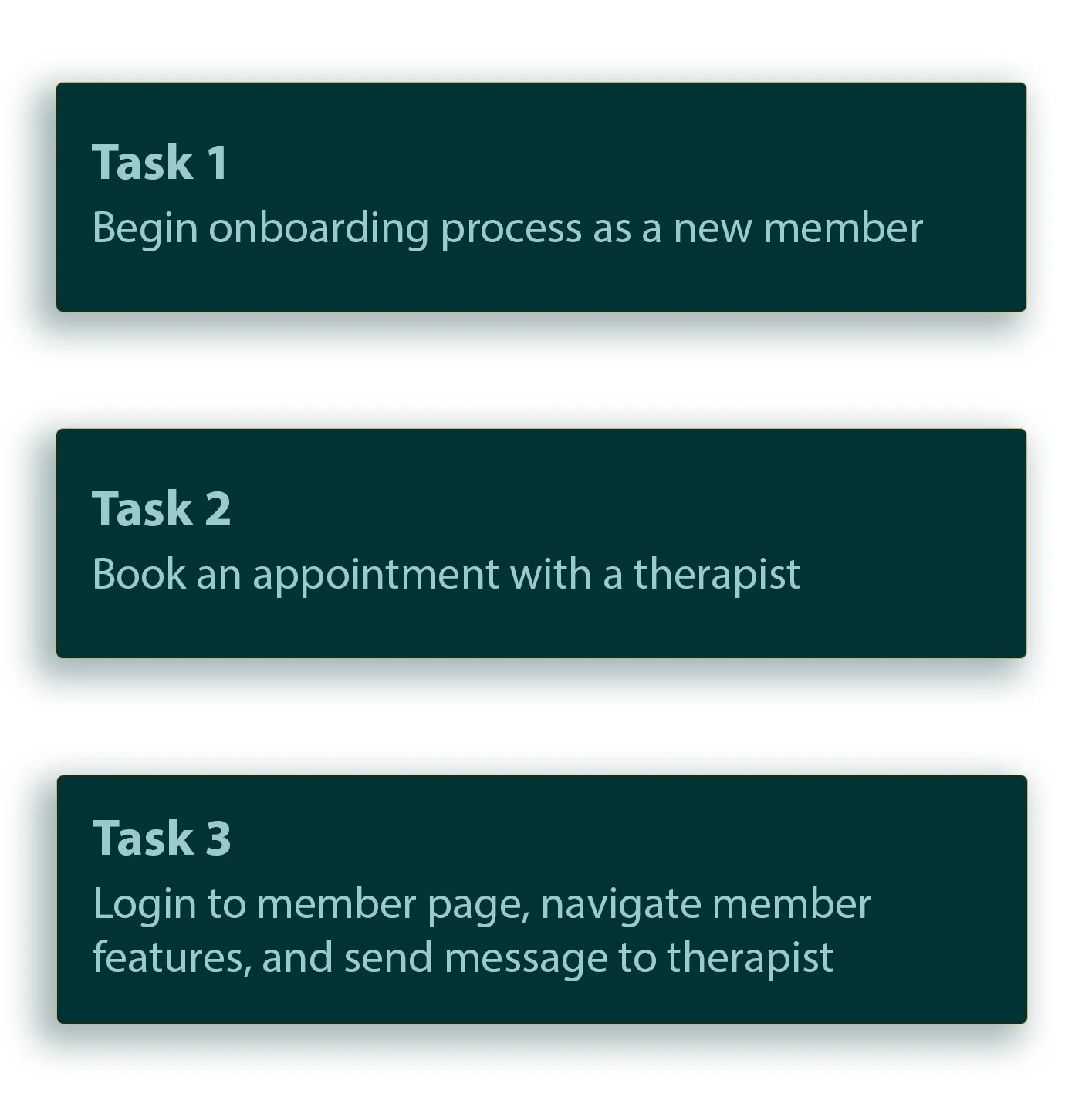
Low Fidelity Prototype Usability Study
The main purpose for conducting usability testing on 7 participants, 2 in-person moderated, 5 via moderated video; was to discover the following user insights:
Identify first impressions on all screens
To reveal any difficulties or roadblocks during navigation
To explore any potential usability issues with current design
I had my participants carry out the below 3 tasks that are the main flows a user would carry out on the platform.
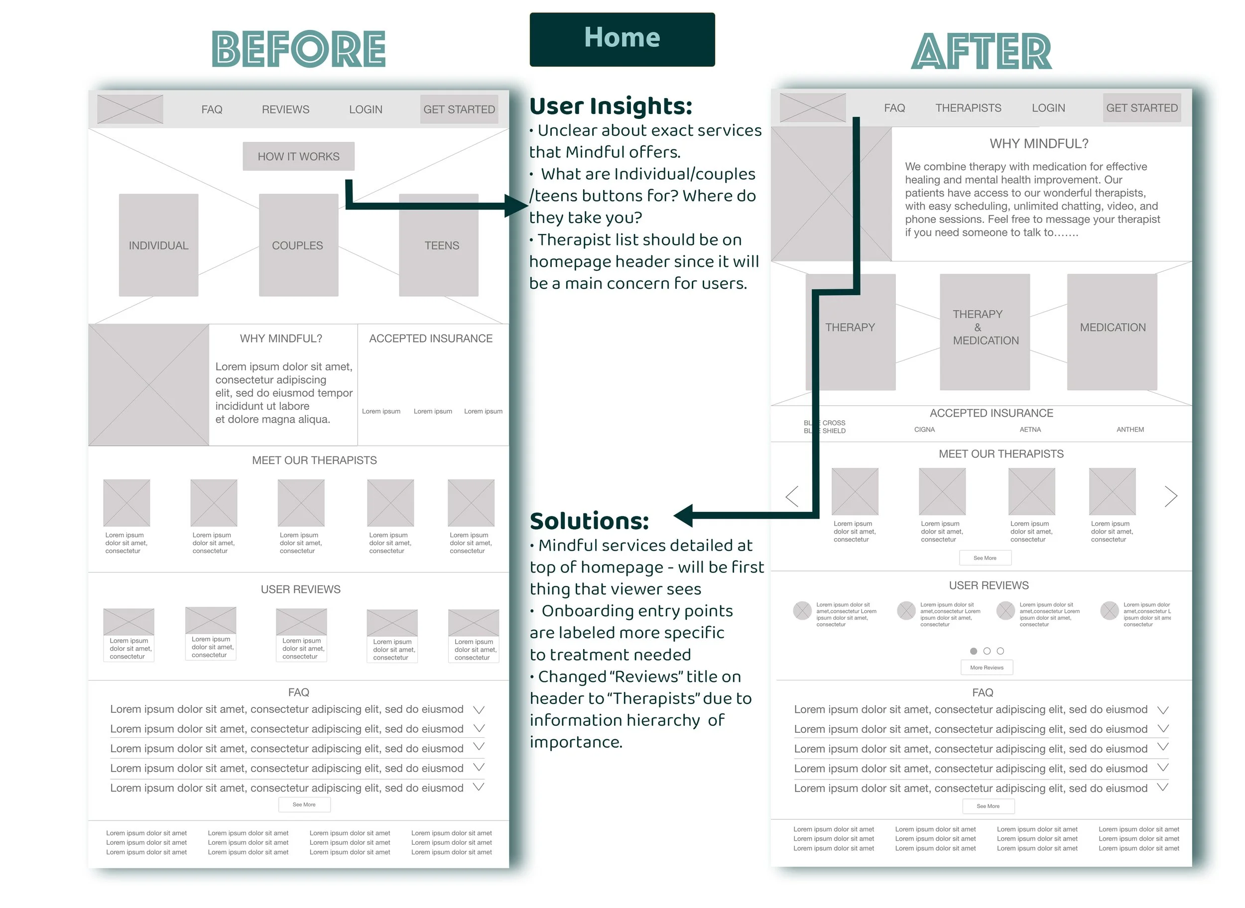
After carrying out the 3 tasks, the below are the most observed issues that needed to be resolved, with solutions to improve design decisions:
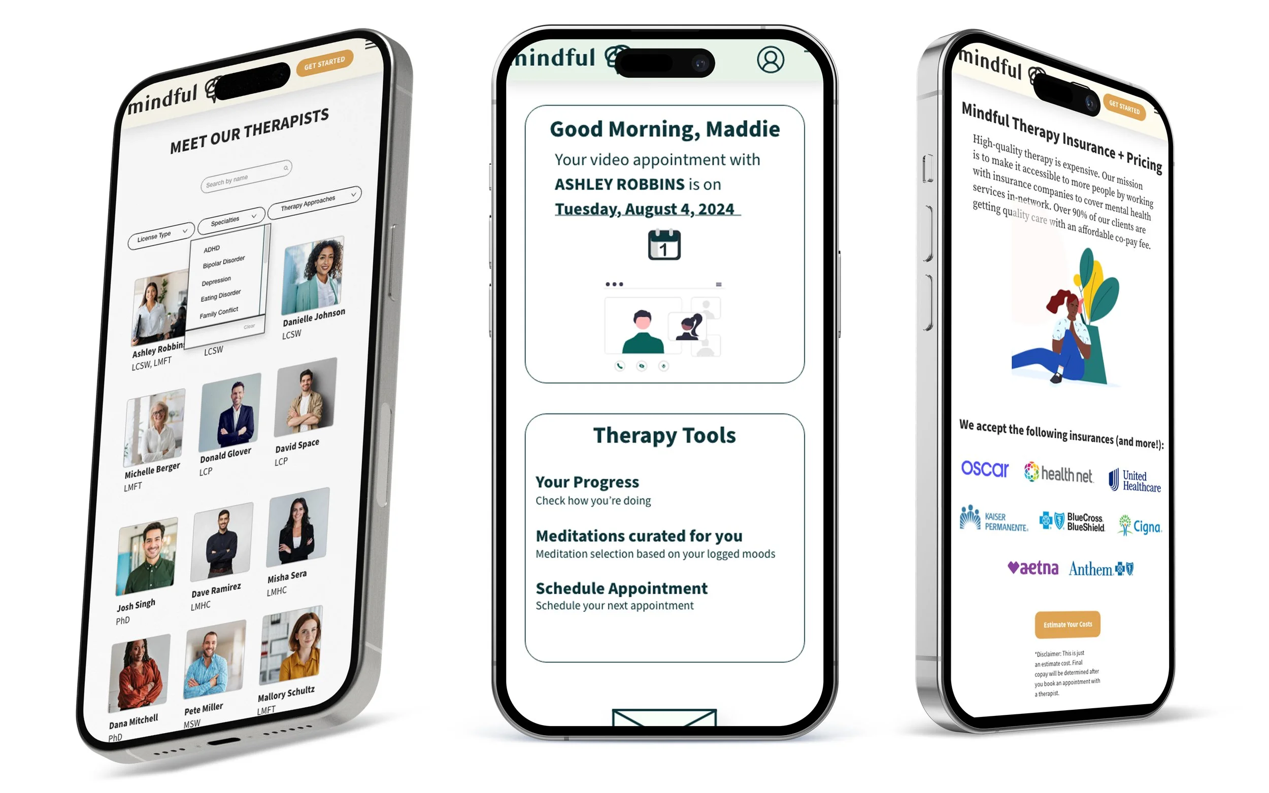
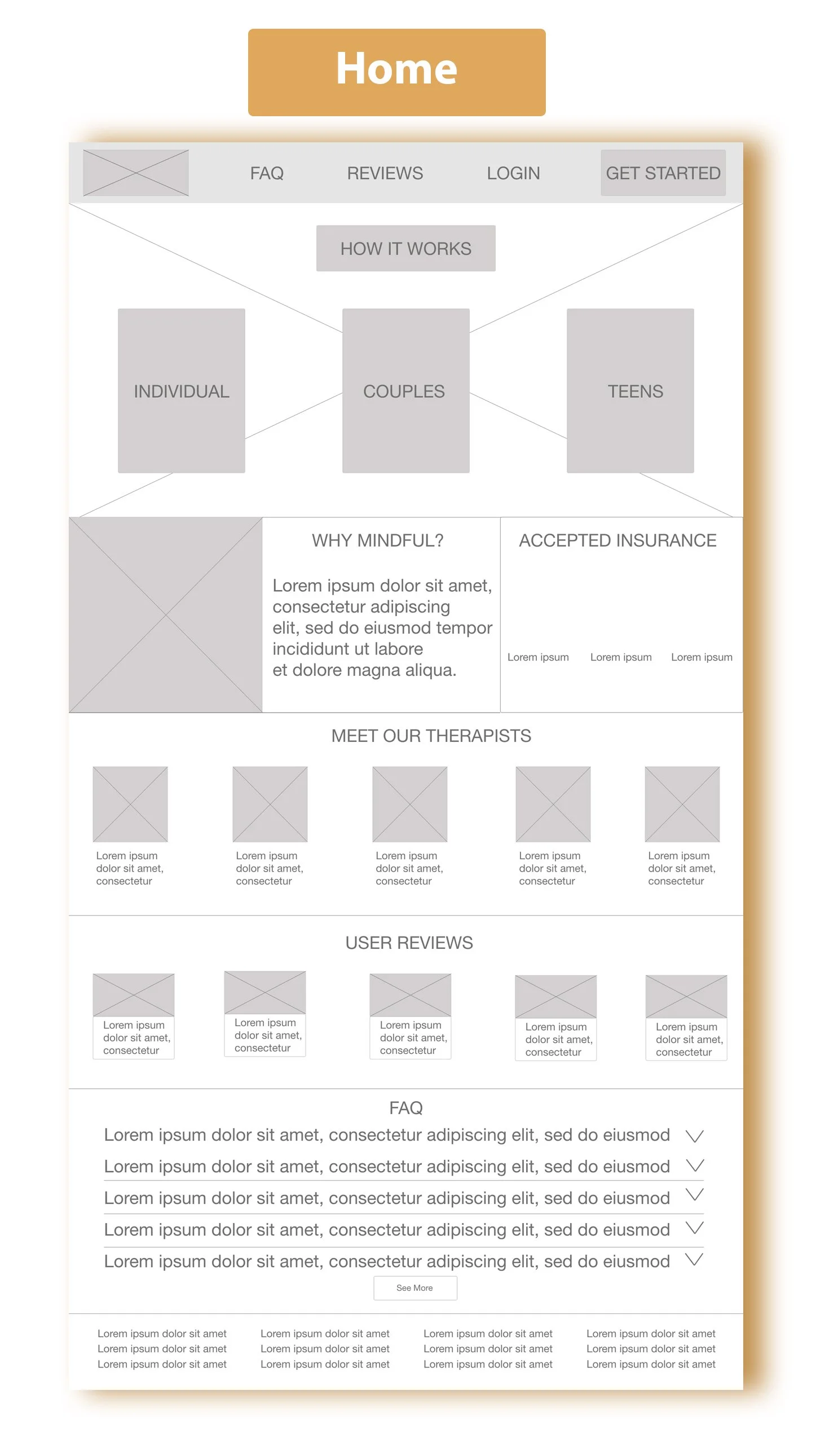
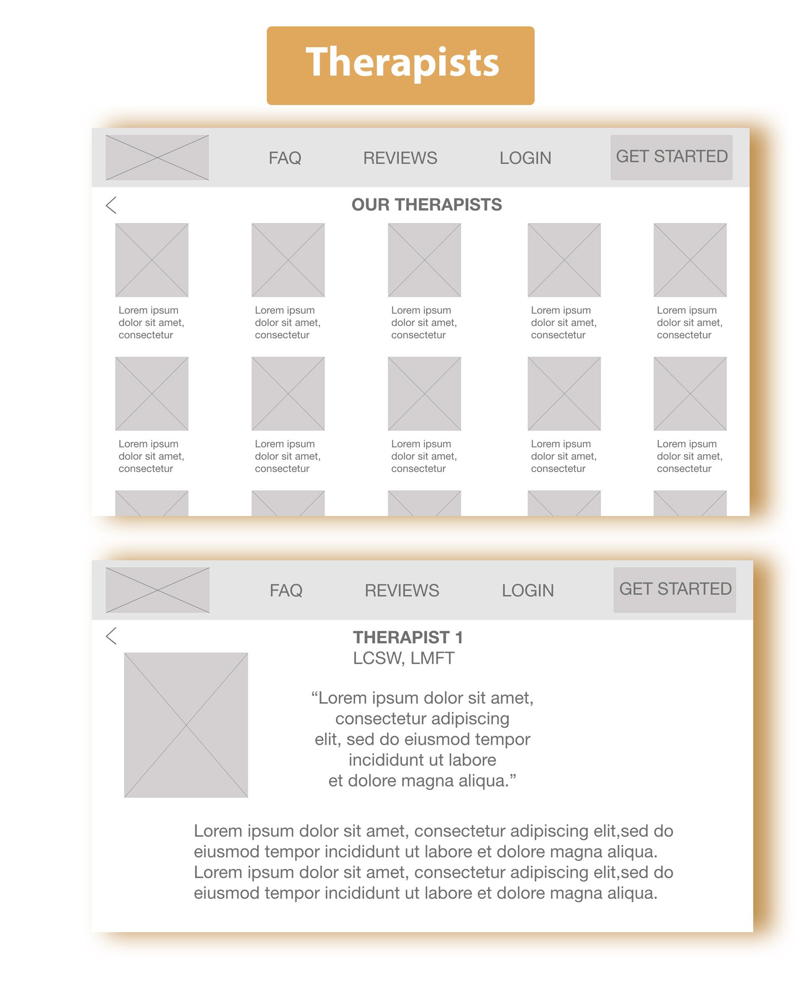
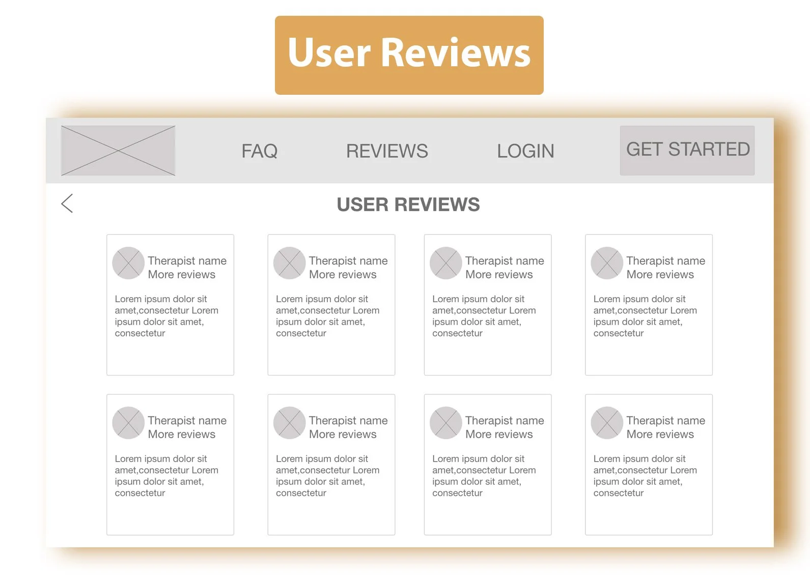
High Fidelity UI Design
Here are some of the polished high fidelity screens with revisions
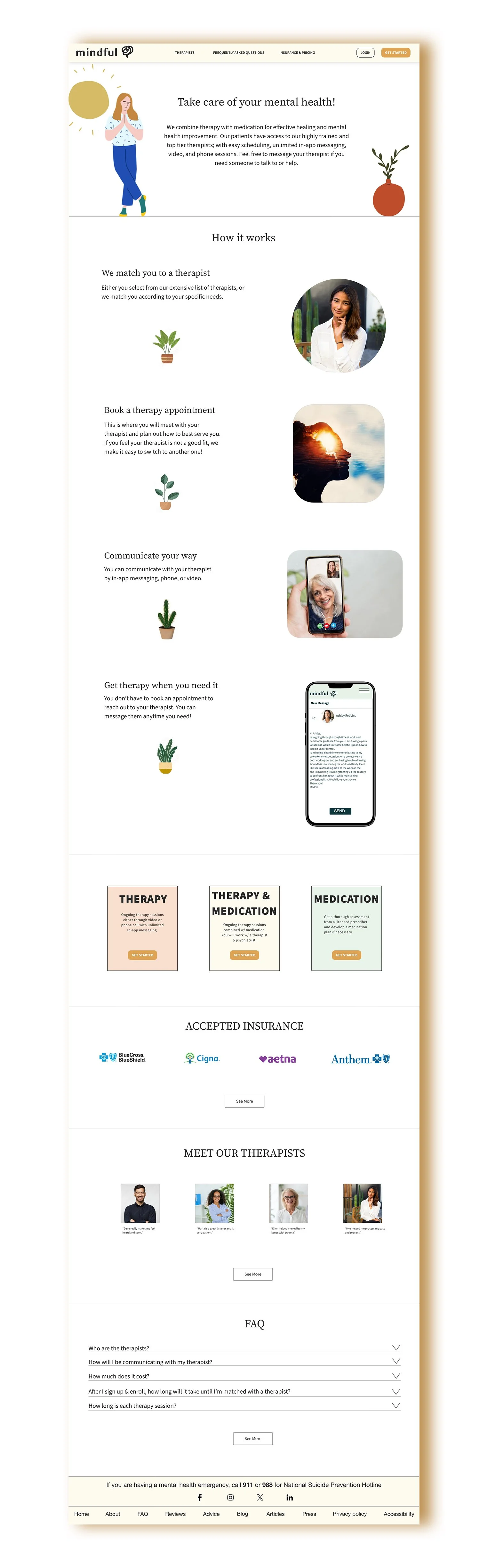
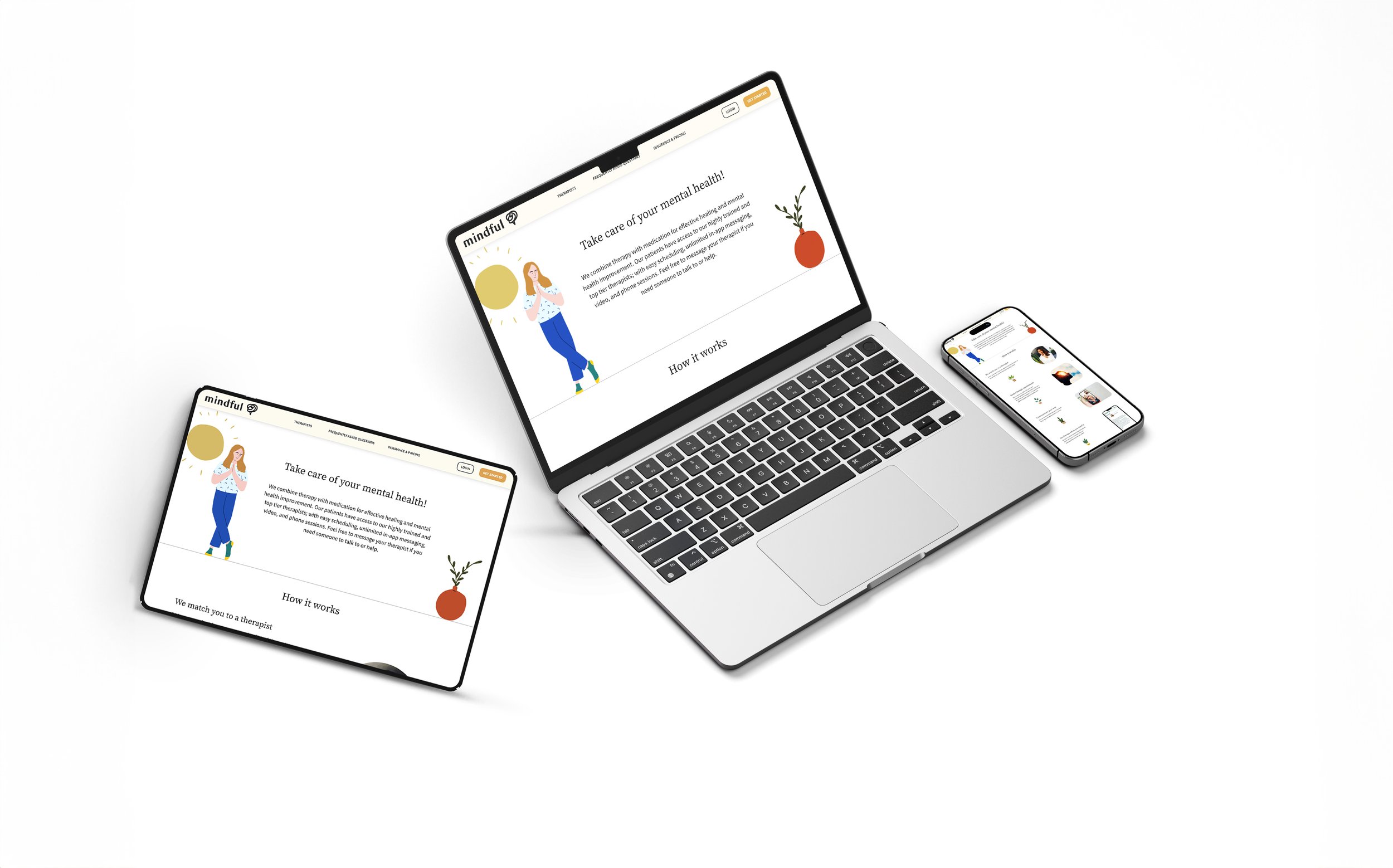
Responsive Design
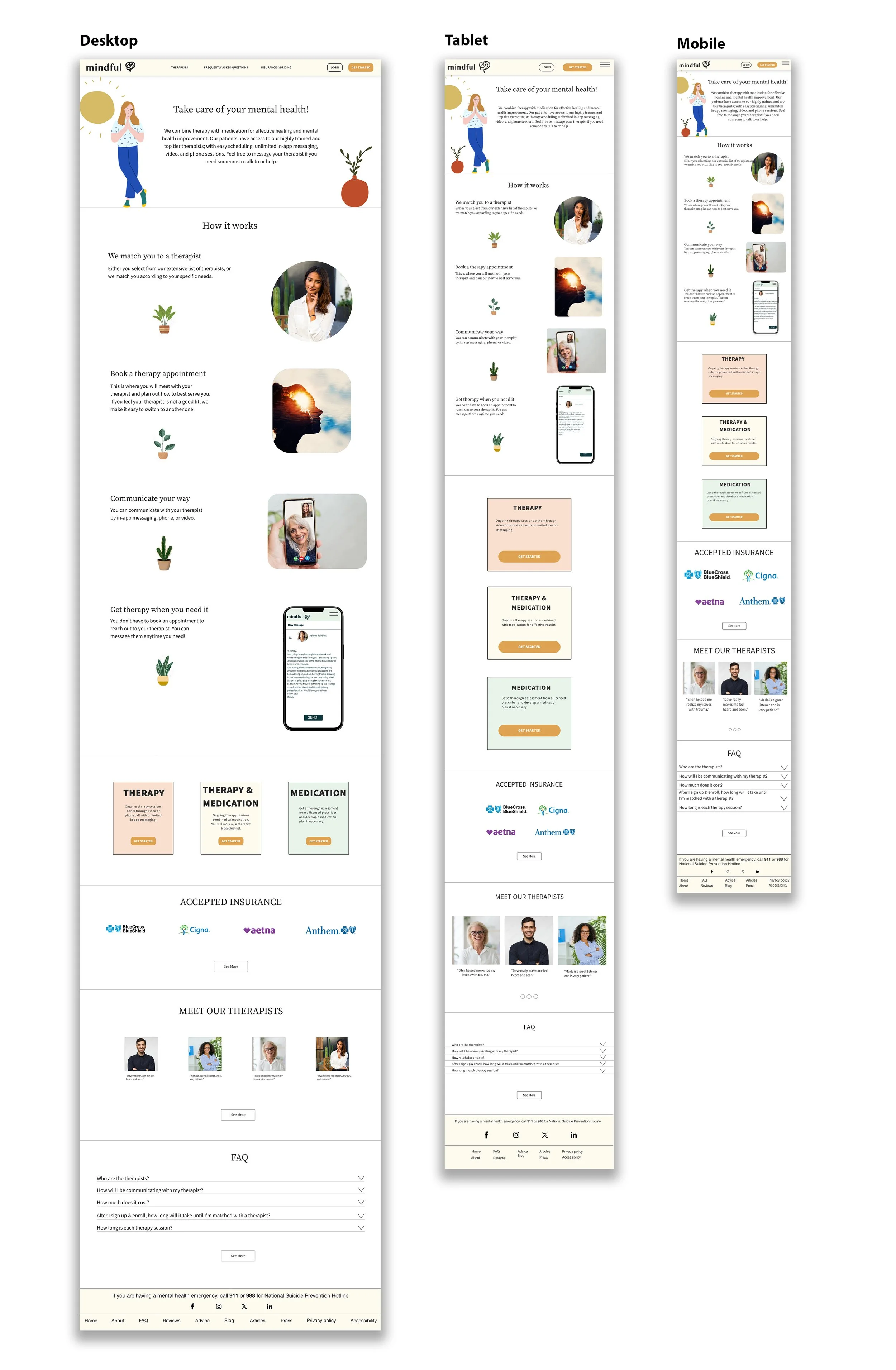
Landing pageHigh Fidelity Prototype
Key Takeaways
Impact
6/7 participants agree that the member features are engaging, enjoyable, and interactive and feel their needs are addressed in a personalized manner.
All participants feel trust towards the platform because estimated costs are provided up front before they even begin the onboarding and login process.
5/7 participants felt the colors and clean design aesthetic gave a calming yet professional clinical feel to the platform.
What I learned
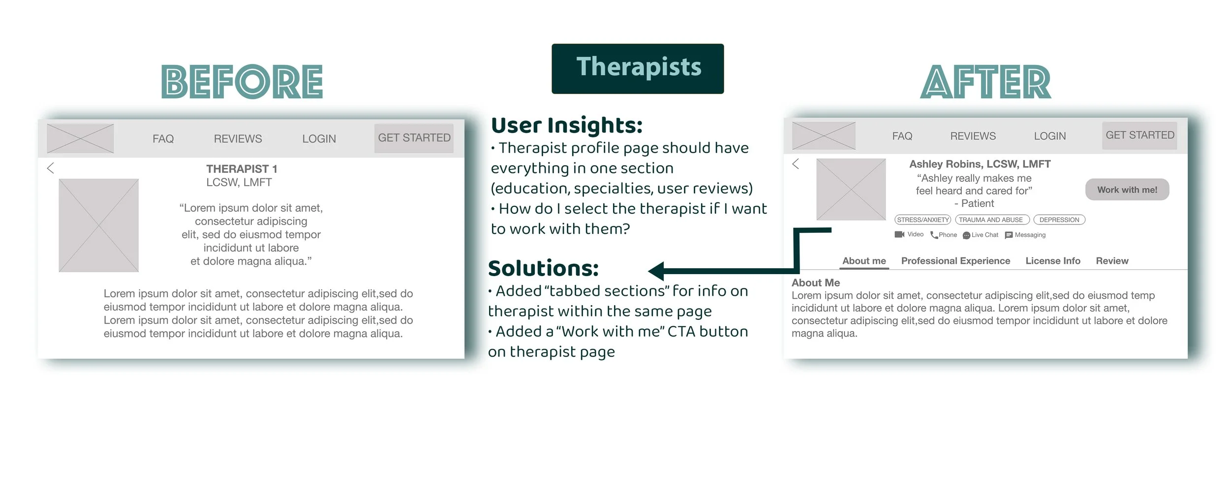
User testing helped me re-design the “Therapists” and “User Reviews” sections to be consolidated into one screen for easy and convenient viewing. They did not like having to click more than a couple times to retrieve info.
Some customers will always still do their own research because they are skeptical of potentially sponsored reviews on the website.
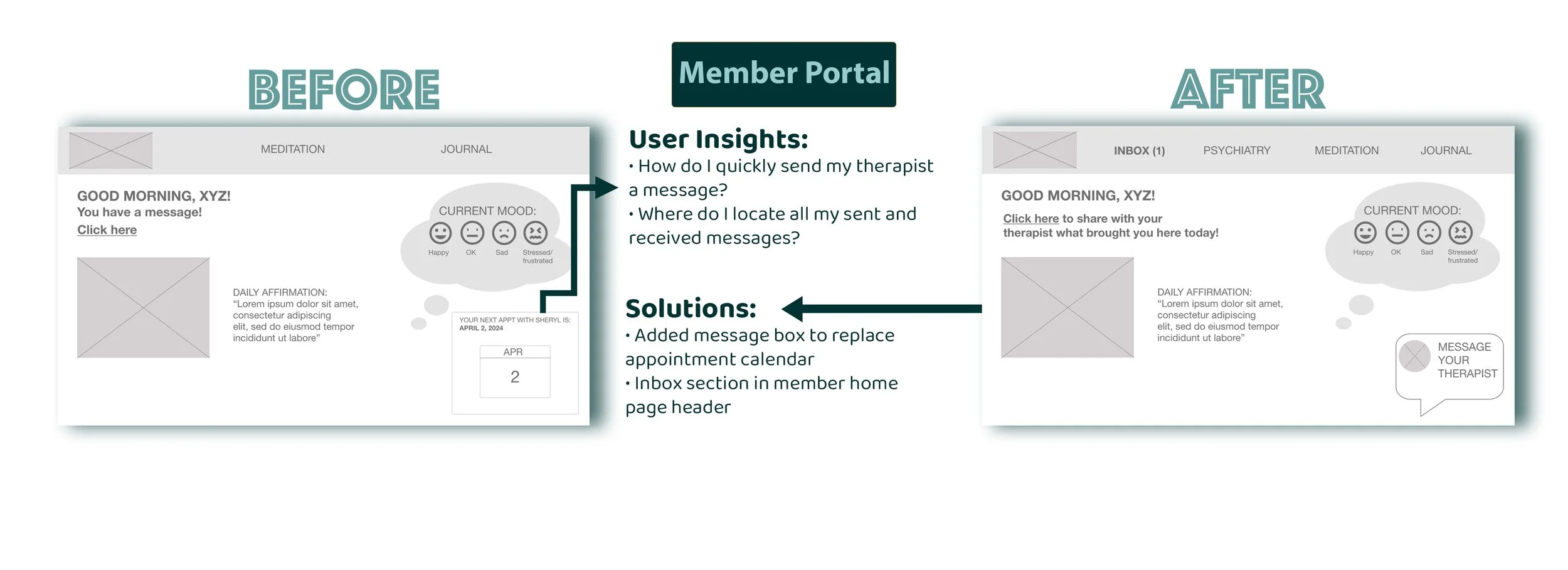
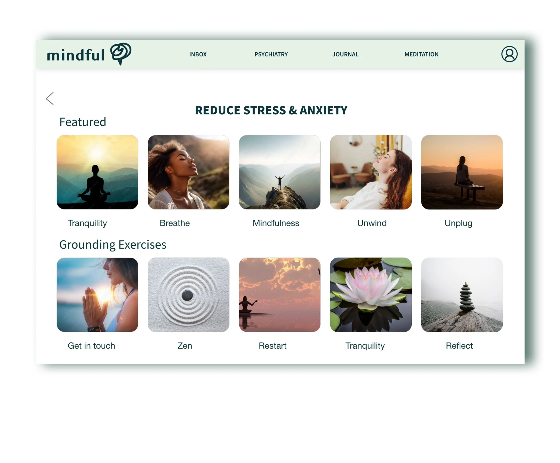
Most users favorite features were the convenient messaging system, curated meditations, and journal section. They said these made them feel taken care of.
Next Steps
If time constraints weren’t an issue I would…
Conduct more testing on final prototype for further improvements on user experience.
Add a quiz assessment before onboarding process to hone in on user’s specific mental health needs. Suggest therapists who specialize in those needs later on in the onboarding phase, instead of having user choose or leaving it up to the system to select.
Include short “About Me” videos for all therapists.
Closing thoughts
This project was something I held very close to my heart, as I had almost lost a very close loved one to suicide. I have close friends and family who have suffered through severe mental health disorders, and through my personal life experiences, deeply emphasize the importance of mental health and seeking professional treatment.
I was surprised to hear that half of my participants did not seek therapy when they needed it, due to unavailability of their preferred therapy service/therapist. All of my participants will only use services that are covered by their insurance. I thoroughly enjoyed this entire process, and it definitely feels good developing a product that is so helpful and needed by humans.