PM Biomedical
Improving the user experience of a biomedical equipment + repair supplier
high level design goals:
Improve user experience of a medical equipment website’s price request user flow.
Decrease drop-off and bounce rate, and increase retention rate.
Increase overall sense of trust in website services.
company overview
PM Biomedical offers a range of services for Patient Monitoring Equipment:
Purchase
Repairs
Rentals
Replacement parts
Cables + accessories
Role:
UX Designer/UX researcher
Duration:
4 months
Tools:
Adobe XD
Figma
Miro
Illustrator
Photoshop
Google Workspace
Zoom
Top selling product at PM Biodmedicalproblem
Currently, 80% of their main customer base orders through phone or in-person sales orders. The CEO wants their website to eventually be the main source for doing business.
Their website has features and flows that need to be reworked.
Based on their analytics, there is an increase in drop-off and bounce rate, and a decrease in retention rate.
Outcome
Analytics suggested that conversion rates had increased by 50% after the re-design was implemented.
4/4 user testing participants thought price request user flow improved drastically.
phase 1: Empathize
Understanding PM Biomedical
Before I began my process, I needed to understand the company’s position in the market, goals, and purpose. Luckily I was able to meet with the stakeholders (CEO + Head of Sales) to debrief on business direction, customer base, desired improvements, and brand mission. This helped me hone in on the problem, align on the project expectations and business goals.
I wanted to find out:
What is causing the increased bounce rate and cart abandonment? What are the stakeholders’ assumptions?
Who are their main competitors?
What are their expectations for the re-design? Which elements do they want to keep or are open to change?
My take-aways from the briefing:
Stakeholders are aware of the reasons to the increased bounce rate and cart abandonment, but do not know how to go about improving on it since they are a fairly new company.
Even though there is a high bounce rate, they are still fairly successful in garnering business with both existing and new customers.
Stakeholders would like to keep the brand aesthetics (logo, style and colors) as much as possible but are open to all other changes that would be beneficial to the user experience and increase retention rate.
Current Competition
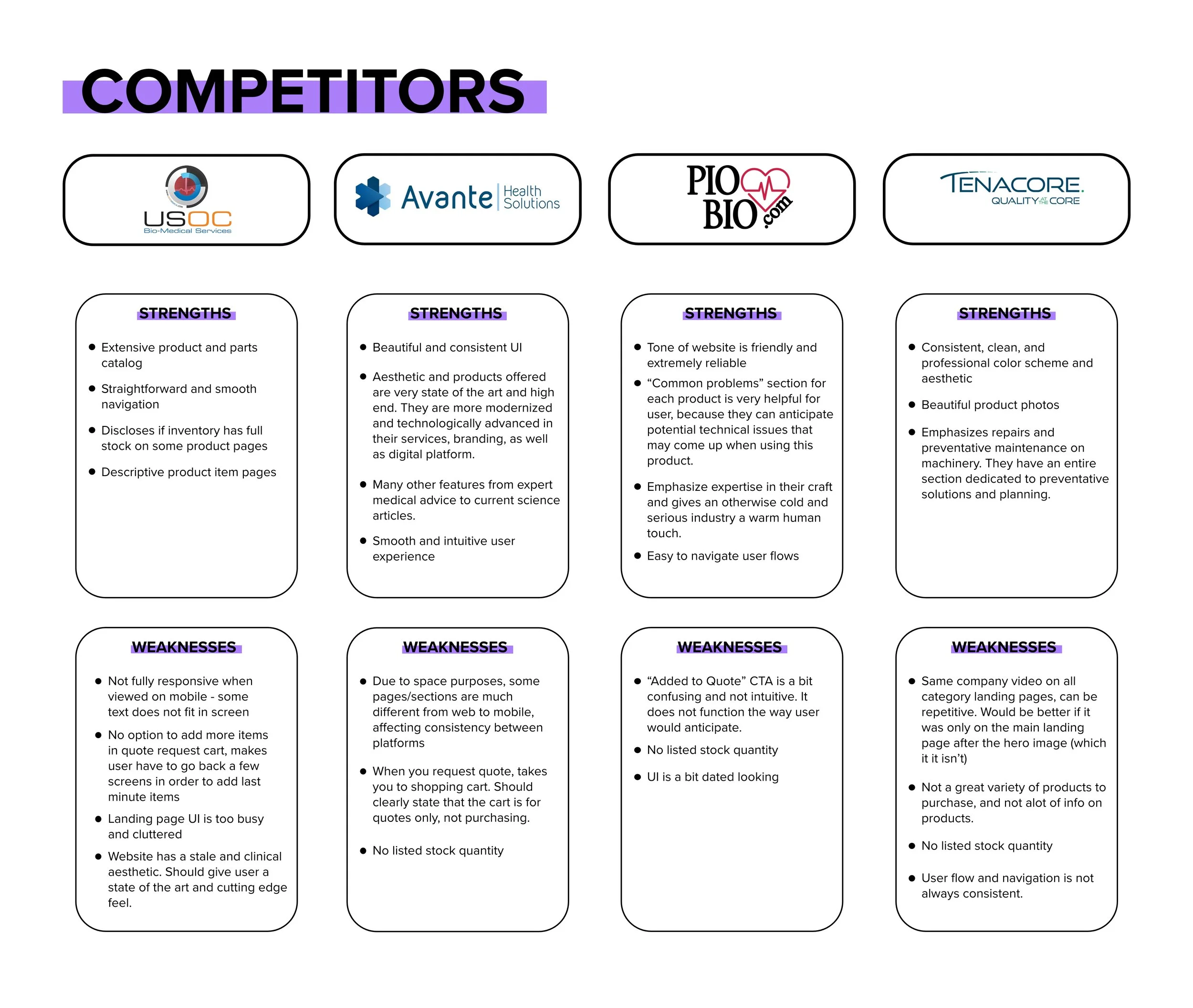
Once I familiarized myself with the company and services, I needed to find out more about its position in the current market. I first researched the main competitors that were outlined in the client brief. I also looked up another biomedical equipment brand that was more successful, with a larger presence.
At this point, I can see WHY PM Biomedical is having trouble with customer retention and increased bounce rate.
Observations:
This brand is newer than the others and does not have as much of an online presence
The website lacks clear flow and intuitiveness.
As of late, most of their customer orders come through in-person meetings and phone calls. Will need to transition old and new customers to mainly website use.
Some website features do not function as expected, causing a lack of trust for the user.
User Interviews and Testing:
Let’s see if my observations checked out! My next step was finding participants to conduct User Testing on so I can observe how users presently try to navigate and carry out actions through the current website.
Challenges/Constraints:
It was a bit difficult finding the actual real-life user of these services. Not only did they need experience working in healthcare, but also had to be familiar with purchasing/renting and repairing patient monitoring equipment.
I did my best in attempting to test actual clients of PM Biomedical, but to no avail.
Fortunately, I was able to contact a few healthcare workers, and they were able to refer me to the right people that represent the target user.
My hypothesis was for the most part correct:
Due to some functions not operating as expected, users were discouraged and annoyed as they navigated the website.
There were some aesthetic choices, such as grey text, that gave users the impression that the website was either nonfunctional or would malfunction.
I set up a phone meeting with the stakeholders, and they were very pleased with the research and surprised at all the discovered insights.
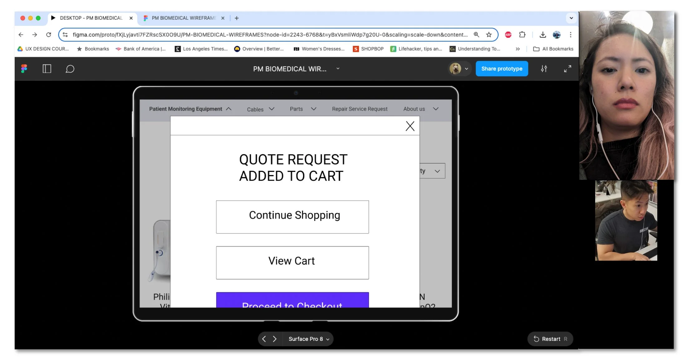
All of the participants were confused when they clicked on the Request Quote CTA button for an item, that item was automatically added to cart without an interactive response such as a screen change or dialog box.
Additionally, the grey text that was present throughout the website also caused the participants to question the validity of this website.
User Persona
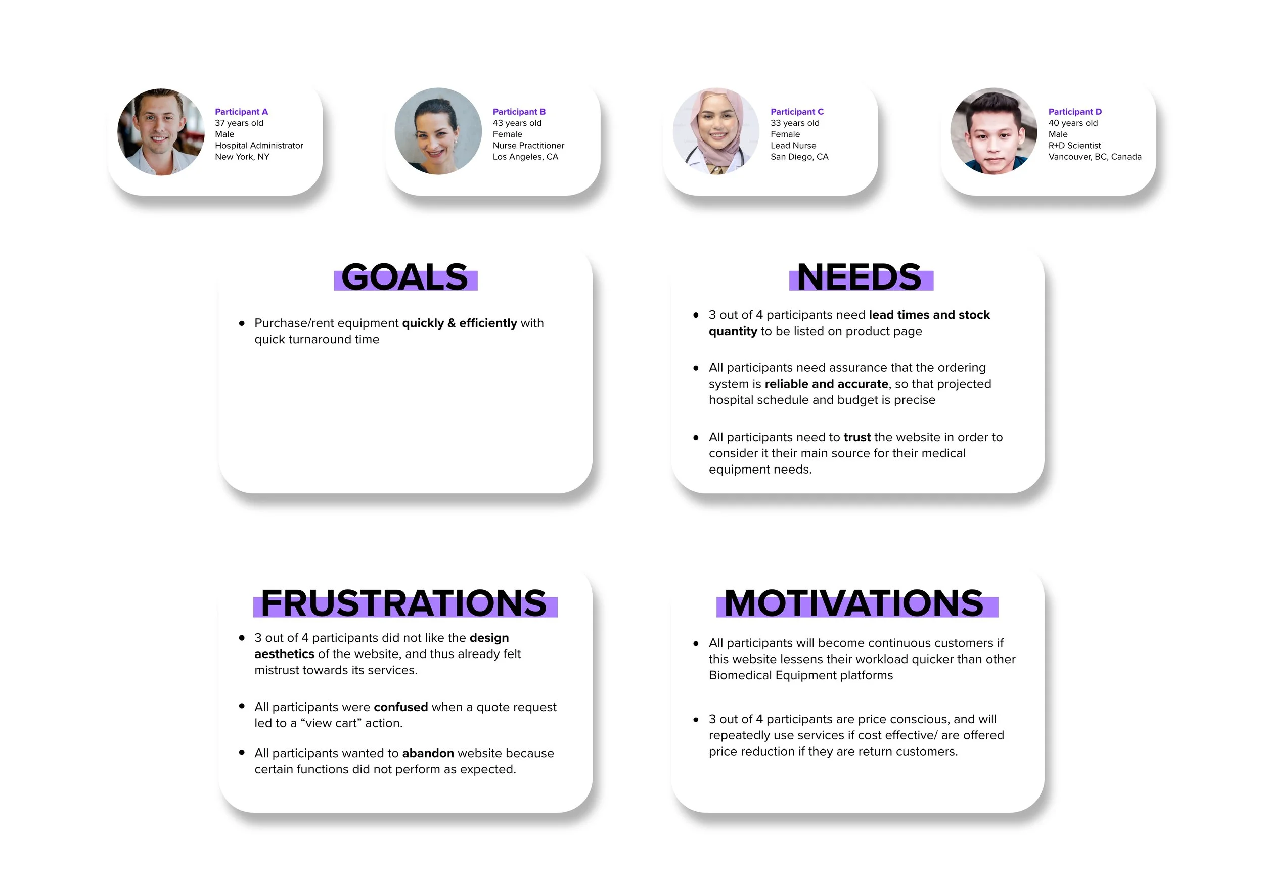
Based on my client briefing, research, and interviews, I mapped out a key persona/empathy map of a typical user of a service like this one. My insight tells me that they are mainly healthcare or pharmaceutical workers, who access this service through desktop, hospital computer system, or laptop. By understanding their frame of mind, I can take them out of this negative experience and onto the path of happiness.
phase 2:define
Project Goals
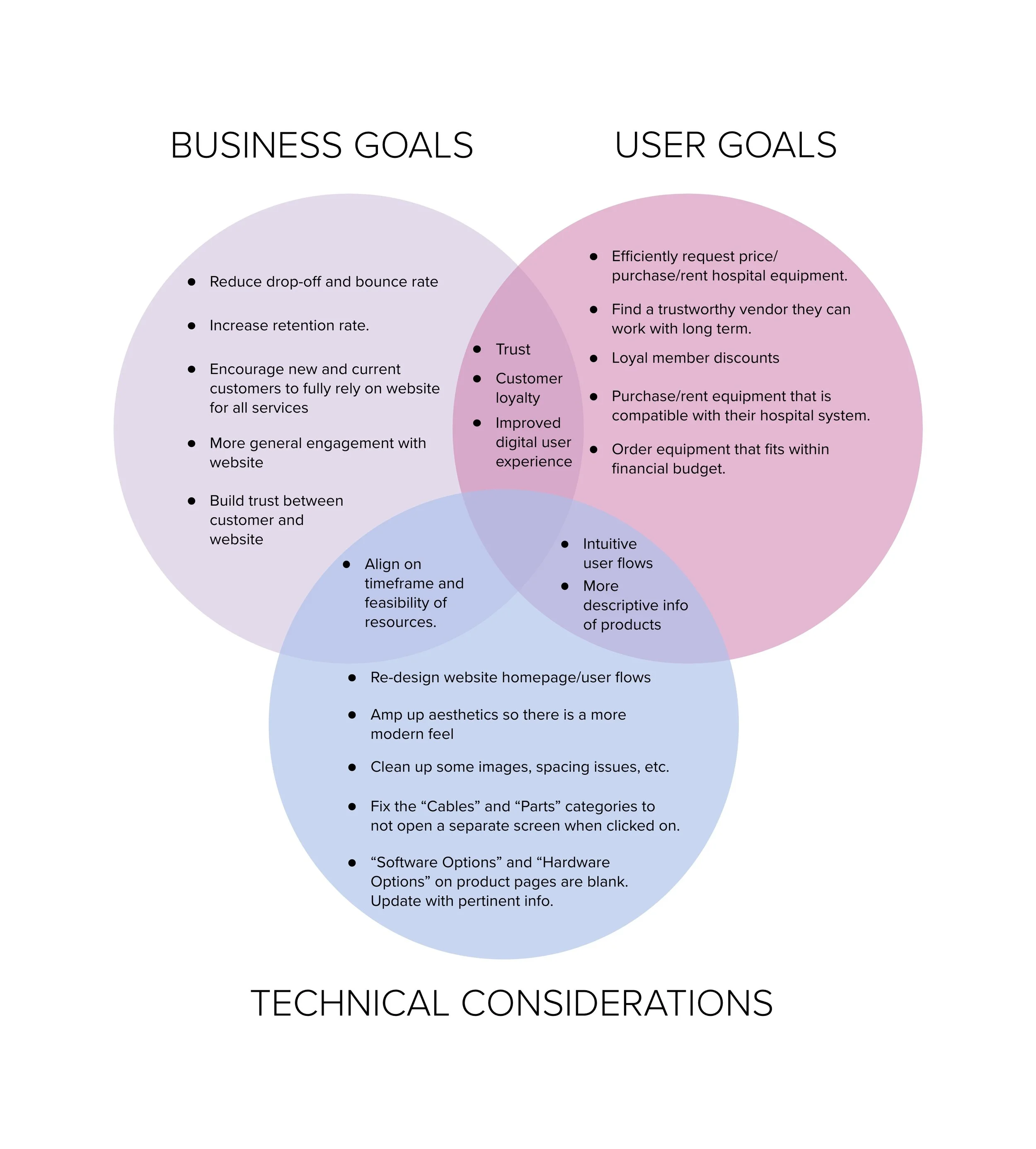
Based on my conversation with the stakeholders and the User Test research, I mapped out the business goals, user goals, technical considerations, and the shared goals to prioritize the re-design.
Impact/Effort Matrix
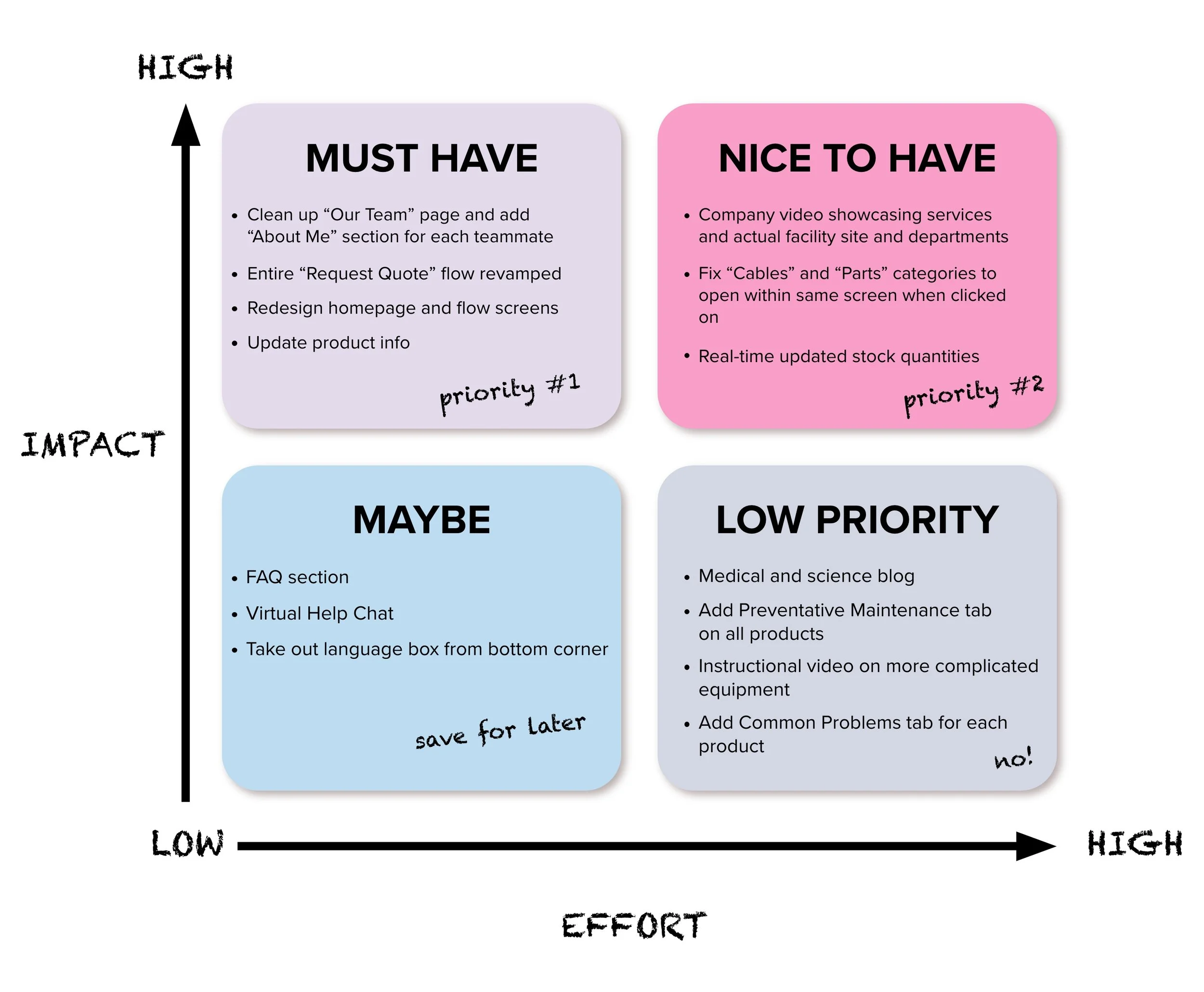
In order to prioritize the workload to be completed within the given deadline, I organized all the features based on levels of impact and effort and reviewed with the stakeholders to align. They agreed with how the matrix was laid out from MUST HAVE to LOW PRIORITY. We are on our way to mapping out the new skeleton of the website!
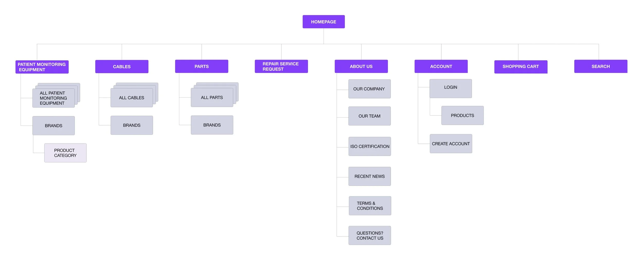
Site Map
I laid out the information architecture based on information from my Impact/Effort Matrix. Half of my participants preferred the products to be organized by brand name since that is how they filter through items on the job.
Task Flow
I created the main task flow a user would have to complete - requesting quotes on several products and completing the Request Quote checkout process.
phase 3:Ideate
Plan + Ideate
Now onto the visual design!
Keeping within the brand’s color aesthetic, I mainly changed the body text color from grey to black, per all participants’ feedback.
My stakeholders sent me all pertinent files, and I went to work on gathering data and notes for the re-design. The business platform they use is Wordpress, which has all their business data, SEO tools, and analytics on it; I had to work within the constraints of this platform.
Re-design
Drawing inferences from my research and user/business goals, I jotted down notes on what to change from the original website layout. I directly translated personas’ needs and what I learned from user interviews, project goals, and impact/effort matrix into design considerations to better understand how I could make quote requests/purchasing/renting of biomedical equipment as user friendly as possible.
Original WebsiteDesigning Our Way Out Of A Bad Experience
That’s more like it!
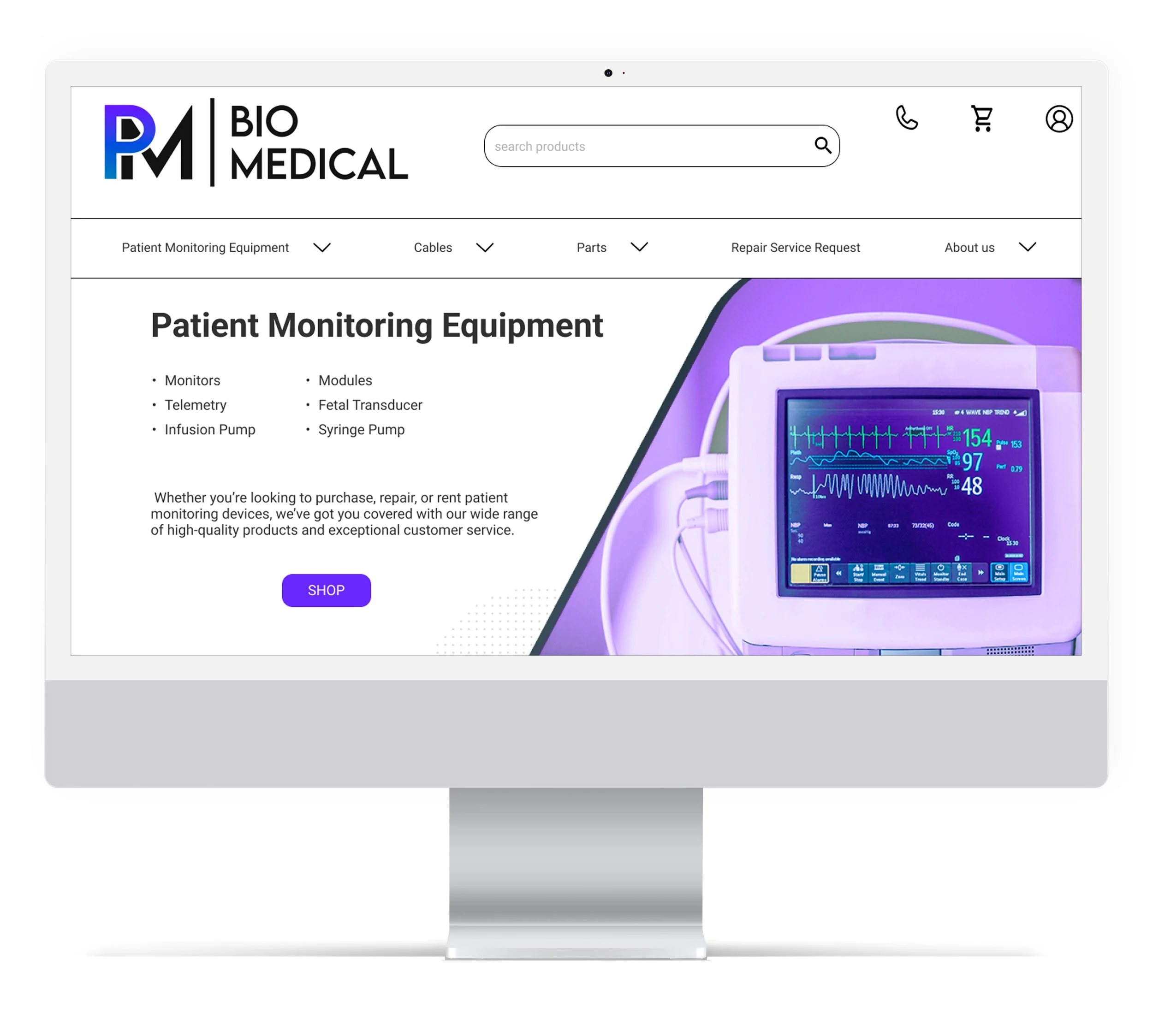
The landing page is much easier to navigate and displays all the important information user needs to move through easily.
Here are a few of the landing page changes to note:
Hero carousel is now a hero image showcasing the featured product in a visually clear manner, and as you scroll down, everything is laid out with emphasis on information hierarchy.
Unnecessary images and info were taken out to give user a cleaner UI and smoother navigation.
CTA buttons are uniform and eye catching.
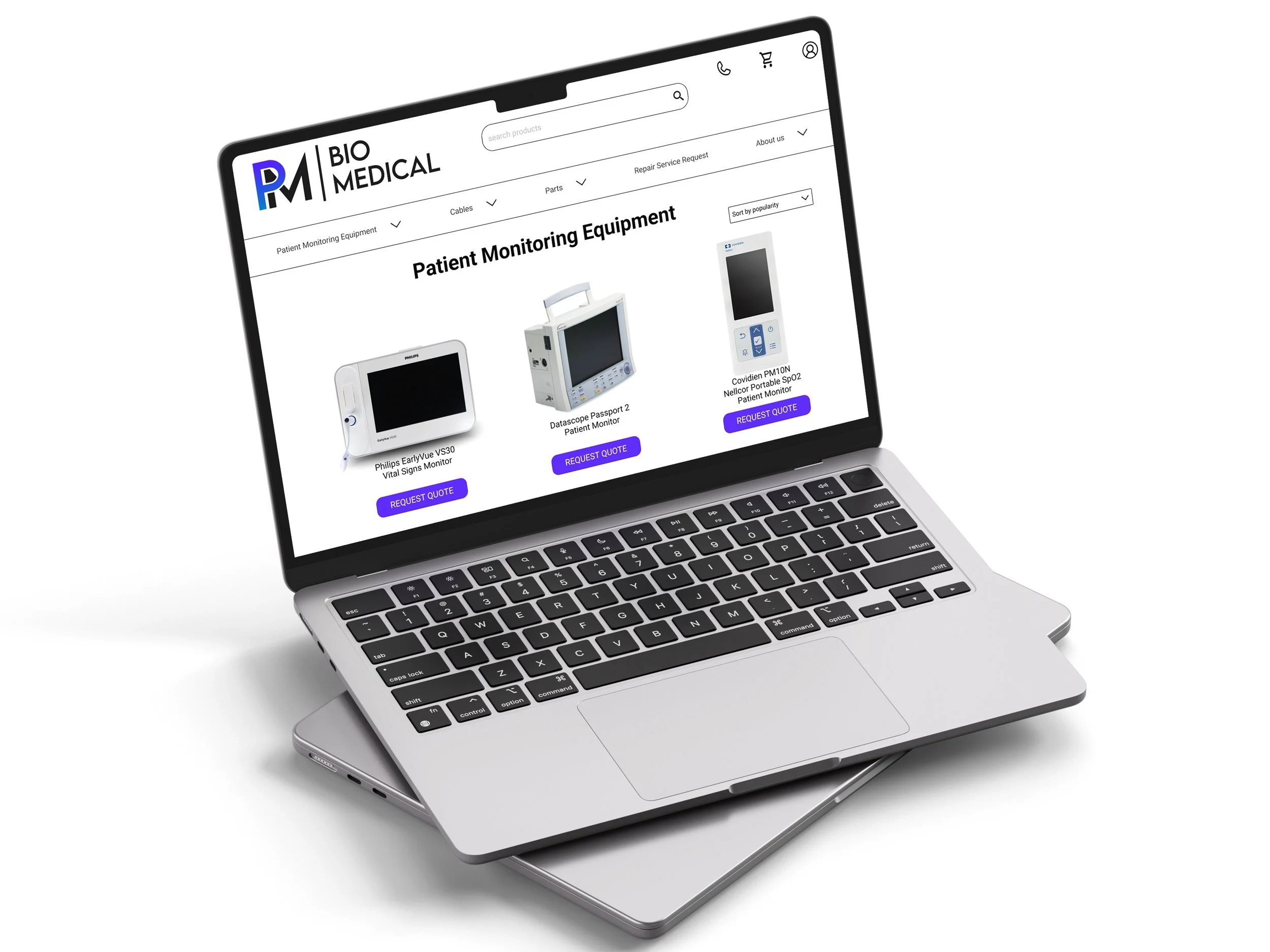
The Quote Request Dialog Box, Cart, and Checkout screens are more intuitive and clear.
phase 4: Prototype
Hi-Fidelity Prototype
Now that the prototype is completed, I reviewed it with my stakeholders. They were extremely pleased with the overall re-design and prototype and couldn’t wait for it to be implemented and live on their website. But first, I’ll need to user test!
phase 5: Test
Usability Testing
It was time to test overall usability of the re-designed pages and whether they meet the goals and needs of the users.
Objectives
Test the general ease of the redesign (landing page, quote request navigation, layout, look & feel)
Do users feel the main quote request checkout flow makes sense?
Do they feel confident when requesting quote/purchasing/renting from the site?
Was the redesign effective?
Have I resolved any challenges/issues the user faced from the old design?
Participants
Early 30’s to early 40’s healthcare workers who have ordered biomedical equipment as part of their job duties.
Task: To request quote on several products
There are new incoming patients, and there are not enough patient monitoring machines for everyone once the beds fill up.
You request several quotes from different vendors, and PM Biomedical is one of them. You arrive on the PM Biomedical landing page and browse its products to find exactly what you need for the hospital. Please proceed to request quotes for several pieces of equipment.
*This is to test the overall flow of the re-design and whether the customer is able to easily navigate the entire quote request process.
Feedback:
“Huge improvement from the original website!”
“I like that you can add items from the cart since I tend to forget parts that go with the machinery.”
“I have more trust in this company’s products and services now.”
Key Takeaways
Impact:
All participants that tested have stated that the user flow is much better than original website.
3/4 participants felt they had more trust in this company and its services after the changes.
3/4 participants thought the re-design was cleaner and had a more “state-of-the-art” feel to it.
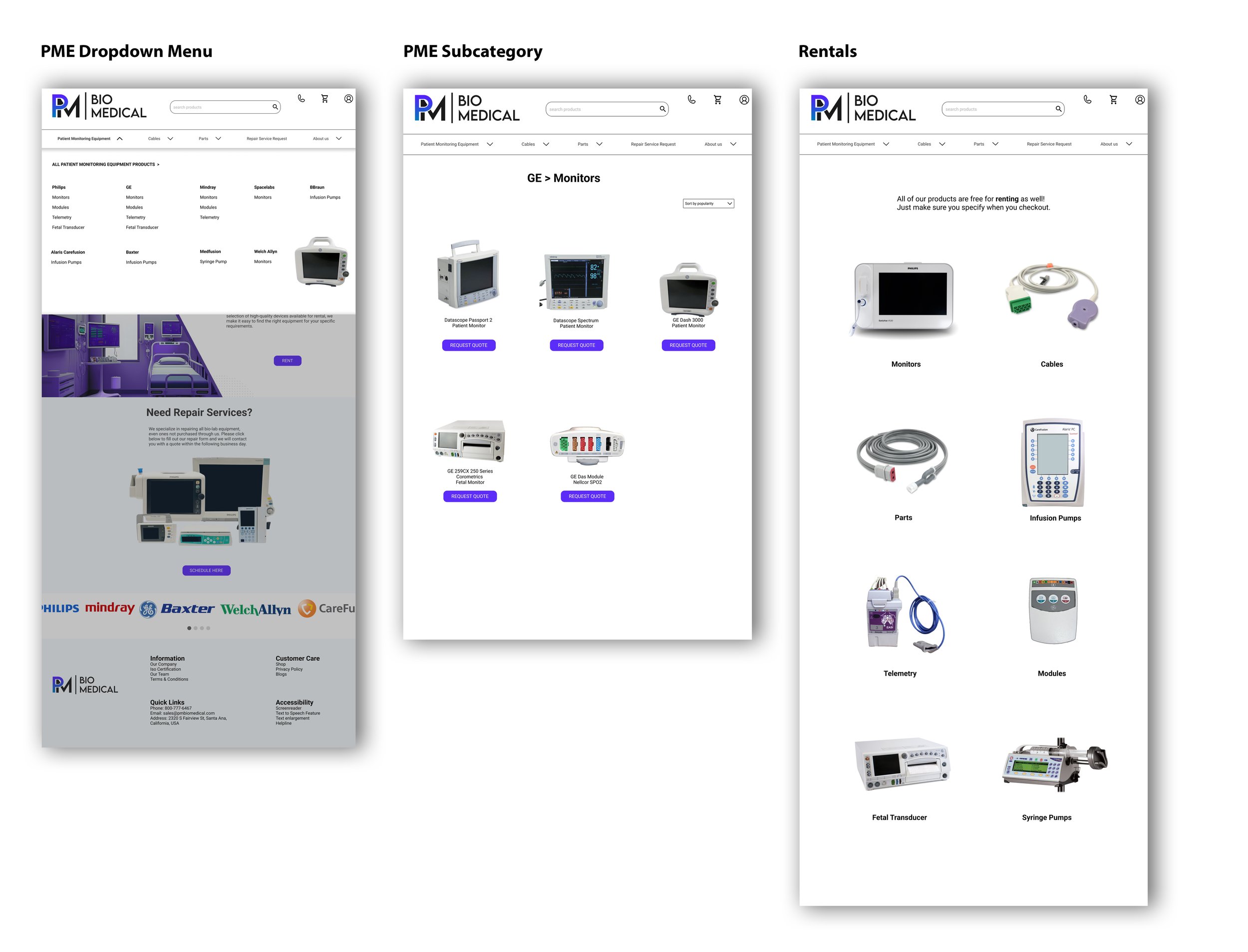
All participants were happy that the brand names hamburger menu was taken out, since it was confusing. It made much more sense to integrate the brand names within the product category.
What I learned:
Some people do not like scrolling too far down the landing page due to cognitive overload. It’s best to try to fit the most important info within the parameters of the first few mouse scrolls.
People have expectations on how websites should function. If the site deviates even a little from user assumptions, they will most likely not click deeper into the site to carry out their intended action.
Limitations:
Had to design within the stakeholder’s color theme, UI elements, and original landing page photos.
Stakeholders require that the end product works within the constraints of the Wordpress template they had initially purchased for the business.
Not enough analytic data at the time, on Wordpress business platform, to determine quantitatively if cart abandonment rate decreased. However, data suggested that conversion rates had increased by 50% after the re-design was implemented.
Limited availability of actual users of this product.
Next Steps:
Re-test to make sure site is responsive across desktop, tablet and laptop devices.
Check analytics (when available) to see if website re-design achieves the goal of reducing abandonment cart rates and increasing conversion rates consistently.
Closing thoughts
I was very excited at the opportunity to apply my knowledge and skillset to a real world problem, and this problem was rather frustrating. It is well known that healthcare workers these days are understaffed, overworked, and stressed out. The last thing they need is friction when trying to order urgent patient monitors for patients in a critical state.
I have never worked in the healthcare field before, much less become familiar with biomedical equipment, so it was a bit daunting at first to try to understand this type of user. But after investigating this problem, speaking with, and testing the participants, I have gained a deeper level of empathy for this user and made sure my designs reflected this.


